Fit models to data
This page provides tips and recommendations for fitting linear and nonlinear models to data. Click the reload button on your browser to make sure you are seeing the most recent version.
The main model-fitting commands covered on this page are:
lm()– linear models for fixed effectslmer()andlme()– linear models for mixed effects (uselmerTestandnlmepackages)glm()– generalized linear models for fixed effectsnls()– nonlinear model fitting with nonlinear least squaresgam()– cubic spline, a type of generalized additive model (usemgcvsma()– correct for body sizevisreg– visualize model fits.emmeans– estimated marginal means (magnitudes)
Packages used on page
library(visreg)   # model fit visualizations
library(emmeans)  # estimate effects
library(car)      # linear model utilities
library(lmerTest) # lmer() in lme4 package
library(nlme)     # lme() in nlme package
library(MASS)     # confidence intervals
library(dplyr)    # data manipulation
library(ggplot2)  # graphs
library(smatr)    # correct for body size
library(MuMIn)    # model selection
library(leaps)    # model selection
library(mgcv)     # cubic spline
Read me
Visualize model fits
I highly recommend using visreg to
visualize model fits. The method plots model fitted values in the
univariate case (e.g., simple linear regression and single factor ANOVA)
and “partial residuals” in the y variable against a single
selected explanatory variable x when there are multiple
exlanatory variables. The partial residuals are obtained by subtracting
from y the fitted values for the explanatory variables not
included in the plot. A linear model fitted to these partial residuals
will have the same slope as in the full linear model, so the plot
accurately shows the relationship between y and a selected
x variable. visreg works with mixed models
too, but does not provide confidence intervals (use confint
or emmeans to obtain approximate confidence intervals).
More details about the method is provided by the authors
here.
Estimate magnitudes of effect
I highly recommend the emmeans package to obtain means
and confidence intervals – “marginal means” from fitted models – for
lm() and lmer() fits. These means are
predictions based on a model and are not calculated separately on data
from different groups. For example, the predicted cell means would be
different for a given data set from a model that includes no interaction
terms than a model that includes the interactions. The package will also
carry out post hoc (Tukey) tests between pairs of means. The basics of
the method are provided by the authors
here.
Many useful vignettes are
here. For
glm() fits, emmeans uses the Wald method,
which isn’t as accurate as the likelihood-based method implemented in
the base R confint() function.
Correct for body size etc
Linear models are often used to correct for body size by including a size metric as a covariate (ANCOVA in previous terminology). There are numerous reasons why this can lead to artifacts, as the literature on human brain and body size will attest. The main problem can be described as “equation error” or “errors in x”, which cause the regression slope of a linear model fit to be too low (biased toward 0) compared with the direction of association between size and the trait of interest. The issue isn’t just measurement error. A bias is contributed by any source of variation in size that does not also affect the focal trait. Such sources are always present because the size metric chosen is not the direct cause of the focal trait measurement but only a predictor of it. (See this work for an overview.)
The effect of this bias on size-correction is small if the range of body sizes is the same among the different groups being compared (e.g., species or sexes). But typically a correction for size is needed when a relationship with size is present and the size range is not the same in the different groups. In this case a linear model will often under- or over-correction for size. This caution applies to any linear model attempting to correct for a numeric covariate – not just size.
No perfect solution exists. The lmodel2,
smatr,
and cpcbp
packages incorporates several approaches Below I show how to carry out approaches based
on principal components using the smatr package.
Type I Sums of Squares
By default, the anova() method in R tests model terms
sequentially (“type I sum of squares”). Other statistical
packages such as SAS and JMP use marginal testing of terms in
ANOVA tables (“type III sum of squares”) instead. A bit of explanation
about how they differ is found
here).
Under sequential fitting, the sum of squares for each term or factor
in the ANOVA table is the improvement in the error sum of squares when
that term is added to the linear model, compared with a model including
only the terms listed above it (but not those listed below it) in the
table. This means that the order in which you list the variables in the
lm formula affects the ANOVA table of results, including
the P-values. The formula y~A+B+A:B will lead to
different sums of squares than the formula y~B+A+A:B when
the design is unbalanced. Note that anova() also respects
hierarchy: the intercept is fitted first, before any other terms, main
effects are fitted next, and interactions are fitted last. An
interaction is never tested without its corresponding main effects
included in the model.
Under marginal testing of terms (“type III sum of squares”),
order of appearance of terms in the formula doesn’t matter, and neither
does hierarchy. The contribution of each model term is measured by the
improvement in the error sum of squares when that term is entered last
into the model. Main effects are tested with their interactions already
in the model. The Anova() function in the car
package, combined with a change in the contrasts used to calculate
sums of squares, can be used to fit models using type III sum of
squares (and also Type II, an in-between solution). Instructions are
given below.
A warning from the maker of the car package about
type-III tests:
“Be careful of type-III tests: For a traditional
multifactor ANOVA model with interactions, for example, these tests will
normally only be sensible when using contrasts that, for different
terms, are Anova orthogonal in the row-basis of the model, such as those
produced by contr.sum, contr.poly, or
contr.helmert, but not by the default
contr.treatment. In a model that contains factors, numeric
covariates, and interactions, main-effect tests for factors will be for
differences over the origin. In contrast (pun intended), type-II tests
are invariant with respect to (full-rank) contrast coding. If you don’t
understand this issue, then you probably shouldn’t use Anova for
type-III tests.”
Mixed models
A common error is using the same labels to identify different sampling units in different random groups. For example, the same number codes 1 through 5 might be used to label the 5 subplots of every plot. This will confuse R and cause frustration. Instead, use the codes a1 through a5 to label the subplots from plot “a”, b1 through b5 to label the subplots taken from plot “b”, and so on.
lmer() vs lme()
lmer() (in the lmerTest and
lme4 packages) is emphasized here, but I also show how to
use lme() (in the nlme package).
Luke
(2017; Behav Res 49:1494–1502) shows that inference for linear mixed
models using the methods available in lmer() is more
accurate than inference using lme(). Use the
lmerTest package (which loads the lme4
package) instead of the lme4 package if you want ANOVA
tables. Finally, lmer() can sometimes lead to “singular
fits”. Read about this and possible solutions
here.
When to use ML vs REML
Simulations by
Luke
(2017; Behav Res 49:1494–1502) suggest that the most accurate approach
to testing fixed effects in mixed models is to use REML
(REML = TRUE) and \(F\)-tests with the Kenward-Roger or
Satterthwaite approximations for degrees of freedom. REML should also be
used when estimating variance components for random effects in mixed
models. These are the defaults in lmerTest. However, ML
(REML = FALSE) should be used if you decide to use
likelihood ratio tests to test fixed effects in mixed models, or if you
are carrying out model selection with AIC or BIC to compare models with
different fixed effects. The reason is that mixed models with different
fixed effects (such as the “full” and “reduced” models compared when
testing a fixed effect) do not have comparable likelihoods when fitted
using REML (see the discussion
here).
However, once the “best” model is found, refit using REML to obtain
estimates of the random effects.
boundary (singular) fit message
This can happen when the estimated variance among random groups is
zero. It is unlikely that the true variance among random groups is zero,
but estimates can go to zero because of high sampling error when the
number of groups is small. Various solutions are possible, but an easy
one is to use the blmer() command in the blme
package instead of lmer(). The blmer()
function behaves similarly to lmer() but it incorporates a
penalty on the variance in the likelihood that reduces the chances that
estimates will go to zero. To try this you’ll have to install the
blme package.
Fit a linear model
Linear models for fixed effects are implemented in the
lm() method in R. You can pass a data frame to the
lm() command, using a formula to indicate the model you
want to fit.
z <- lm(response ~ explanatory, data = mydata)
z <- lm(response ~ explanatory, data = mydata, na.action = na.exclude)
The resulting object (which I’ve named z) is an
lm() object containing all the results. You use additional
commands to pull out these results, including residuals and predicted
values. The argument na.action = na.exclude is optional —
it tells R to keep track of cases having missing values, in which case
the residuals and predicted values will have NA’s inserted for those
cases. Otherwise R just drops missing cases and the result of your
predict() command will not have the same number of cases as
the original data.
Here are some of the most useful functions to extract results from
the lm object:
summary(z)     # parameter estimates and overall model fit
plot(z)        # plots of residuals, normal quantiles, leverage
coef(z)        # model coefficients (means, slopes, intercepts)
confint(z)     # confidence intervals for parameters
resid(z)       # residuals
predict(z)     # predicted values
predict(z, newdata = mynewdata) # see below
fitted(z)      # predicted values
anova(z1, z2)  # compare fits of 2 models, "full" vs "reduced"
anova(z)       # ANOVA table (** terms tested sequentially **)
The command predict(z, newdata = mynewdata) will used
the model to predict values for new observations contained in the data
frame mynewdata. The explanatory variables (the X
variables) in mynewdata must have exactly the same names as
in mydata.
In the case of simple linear regression you can add a line to a
scatter plot of the data using the abline() function.
plot(response ~ explanatory, data = mydata)
z <- lm(response ~ explanatory, data = mydata)
abline(z)
Basic types of linear models
In the examples below, I’m assuming that all the variables needed are
in a data frame mydata.
The simplest linear model fits a constant, the mean, to a single variable. This is useful if you want to obtain an estimate of the mean with a standard error and confidence interval, or wanted to test the null hypothesis that the mean is zero.
z <- lm(y ~ 1, data = mydata)The most familiar linear model is the linear regression of y on x.
z <- lm(y ~ x, data = mydata)If A is a categorical variable (factor or character)
rather than a numeric variable then the model conforms to a single
factor ANOVA instead.
z <- lm(y ~ A, data = mydata)More complicated models include more variables and their interactions
z1 <- lm(y ~ x1 + x2, data = mydata)         # no interaction between x1 and x2
z2 <- lm(y ~ x1 + x2 + x1:x2, data = mydata) # interaction term present
z2 <- lm(y ~ x1 * x2, data = mydata)          # interaction term present
Analysis of covariance models include both numeric and categorical variables. The linear model in this case is a separate linear regression for each group of the categorical variable. Interaction terms between these two types of variables, if included in the model, fit different linear regression slopes; otherwise the same slope is forced upon every group.
z <- lm(y ~ x + A + x:A, data = mydata)Simple linear regression
Fit the model to data. Note: avoid calling the variables
mydata\$y and mydata\$x in the
lm() formula, so that R knows to find the variables in
mydata in later commands.
z <- lm(y ~ x, data = mydata, na.action = na.exclude) Add the regression line to a scatter plot. Using ggplot
gives a regression line that doesn’t extend beyond the data points.
plot(y ~ x, data = mydata)
abline(z)
# or
ggplot(mydata, aes(y = y, x = x)) +
    geom_point(size = 2, col = "red") +
    geom_smooth(method = "lm", se = FALSE) +
    theme(aspect.ratio = 0.80) +
    theme_classic()
To obtain the regression coefficients (parameter estimates) with confidence intervals, as well as R2 values,
summary(z)               # estimates of slope, intercept, SE's
confint(z, level = 0.95) # 95% conf. intervals for slope and intercept
To test the null hypothesis of zero slope with the ANOVA table,
anova(z)Add 95% confidence bands to a scatter plot. Use visreg()
or ggplot() (you might need to install and load the
visreg package first).
visreg(z, points.par = list(pch = 16, cex = 1.2, col = "red"))
# or
ggplot(x, aes(y = age, x = black)) +
    geom_point(size = 2, col = "red") +
    geom_smooth(method = "lm", se = TRUE) +
    theme(aspect.ratio = 0.80) +
    theme_classic()
You can use the following also to include 95% prediction intervals on
your ggplot() graph. Heed the warning from the
predict() command.
x.p <- predict(z, interval = "prediction")
x.p <- cbind.data.frame(x, x.p)
ggplot(x.p, aes(y = age, x = black)) +
    geom_point(size = 2, col = "red") +
    geom_smooth(method = "lm", se = TRUE) +
    geom_line(aes(y = lwr), color = "red", linetype = "dashed") +
    geom_line(aes(y = upr), color = "red", linetype = "dashed") +
    theme(aspect.ratio = 0.80) +
    theme_classic()
Here are some useful diagnostic plots for checking assumptions. Most
of the plots produced by plot(z) will be self-explanatory,
except perhaps the last one. “Leverage” calculates the influence that
each data point has on the estimated parameters. “Cook’s distance”
measures the effect of each data point on the predicted values for all
the other data points. A value greater than 1 is said to be
worrisome.
plot(z)        # residual plots, etc: keep hitting enter
hist(resid(z)) # histogram of residuals
Fixed intercept or slope
Here are a couple of useful tricks to constrain parameter values for simple linear regression and plot the results.
Forcing the line through the origin (forcing an intercept of 0)
results in only the slope being estimated. Forcing a slope of 1 or b
through the data results in only the intercept being estimated.
Unfortunately, visreg() doesn’t work well for these
models.
x and y are numeric variables in the data
frame mydata.
# scatter plot in base R
plot(y ~ x, data = mydata)

# Ordinary linear regression, for comparison
z <- lm(y ~ x, data = mydata, na.action = na.exclude)
abline(z)

# Force the regression line through the origin
z <- lm(y ~ x - 1, data = mydata, na.action = na.exclude)
z <- lm(y ~ 0 + x, data = mydata, na.action = na.exclude)
abline(z)

# Force a slope of 1 through the data
z <- lm(y ~ 1 + offset(1*x), data = mydata, na.action = na.exclude)
abline(coef(z), 1)

# Force a slope of "b" through the data (b must be a number)
z <- lm(y ~ 1 + offset(b*x), data = mydata, na.action = na.exclude)
abline(coef(z), b)
You can also specify slope and intercept to add a line to
ggplot(),
ggplot(mydata, aes(x, y)) +
  geom_point(col = "firebrick") +
  geom_abline(intercept = 0, slope = 1) +
  theme_classic()
Single factor ANOVA
Before fitting a linear model to the data, check that the categorical variable is a factor. If not, make it a factor, as this will help later when we fit the model.
is.factor(mydata$A)          # or
class(mydata$A)              # result should be "factor" if A is a factor
mydata$A <- factor(mydata$A) # convert categorical variable A to a factor
Check how R has sorted the factor groups (levels). You will see that R orders them alphabetically, by default, which isn’t necessarily the most useful order.
levels(mydata$A)For reasons that will become clear below, it is often useful to rearrange the order of groups so that any control group is first, followed by treatment groups*. Let’s assume that there are four groups, “a” to “d”, and that group “c” is the control. Change the order in R as follows:
mydata$A <- factor(mydata$A, levels=c("c","a","b","d")*NB: Do not use the command “ordered” for this purpose, which will mess things up.
Fit the linear model to the data. y is the numeric
response variable and A is the categorical explanatory
variable (character or factor).
z <- lm(y ~ A, data = mydata, na.action = na.exclude)Visualize the fitted model in a graph that includes the data points. The second command below is a fast but crude way to add the fitted values to the plot.
stripchart(y ~ A, vertical = TRUE, method = "jitter", pch = 16,
               col = "red", data = mydata)
stripchart(fitted(z) ~ A, vertical = TRUE, add = TRUE, pch="------",
               method = "jitter", data = mydata)
The visreg package provides a fast tool to visualize the
model fit with a strip chart, including optional 95% confidence
intervals for the predicted means.
library(visreg)                                     # loads package, if not done yet
z <- lm(y ~ A, data = mydata)                       # fit model
visreg(z)                                           # basic plot
visreg(z, points.par = list(cex = 1.2, col = "red") # with points options
visreg(z, whitespace = 0.4)                         # adjust space between groups
Or, add the predicted values to your strip chart with base R.
stripchart(y ~ A, vertical = TRUE, method = "jitter", pch = 16,
               col = "red", data = mydata)
yhat <- tapply(fitted(z), mydata$A, mean)
for(i in 1:length(yhat)){
  lines(rep(yhat[i], 2) ~ c(i-.2, i+.2))
  }
Use emmeans package to estimate the group means fitted
by the a single factor ANOVA model, including SE’s and confidence
intervals. You’ll have to install and load the package first, if you
haven’t already done so.
library(emmeans)
emmeans(z, "A", data = mydata)   # use the real name of your factor in place of "A"
Note that these are not the SE’s and confidence intervals you would calculate yourself on each group separately, because they use the residual mean square from the model fitted to all the data. This should generally result in smaller SE’s and narrower confidence intervals. The calculation is valid if the assumption of equal variances within different groups is met.
Use emmeans to carry out Tukey tests between all pairs
of means.
grpMeans <- emmeans(z, "A", data = mydata)
grpMeans
pairs(grpMeans)
plot(grpMeans, comparisons = TRUE)
The pairs() command from the emmeans
package produces a table of Tukey pairwise comparisons between means.
The plot() command produces a visual of the comparisons as
follows: “The blue bars are confidence intervals for the EMMs, and the
red arrows are for the comparisons among them. If an arrow from one mean
overlaps an arrow from another group, the difference is not significant,
based on the adjust setting (which defaults to”tukey”).”
Check assumptions of single factor ANOVA:
plot(z)        # residual plots, etc
hist(resid(z)) # histogram of residuals
Estimate parameters. By default in R, the intercept term estimates the mean of the first group (set this to be the control group or the most convenience reference group). Remaining parameters estimate the difference between the mean of each group and the first (control) group. Ignore the P-values because they are invalid for hypothesis tests of the differences except in the special case of a planned contrast.
summary(z)               # coefficients table with estimates
confint(z, level = 0.95) # conf. intervals for parameters
Test the null hypothesis of equal group means with the ANOVA table.
anova(z)See how R is representing the categorical variable behind the scenes by using indicator (dummy) variables.
model.matrix(z)Fit multiple factors
When two or more categorical factors are fitted, the possibility of
an interaction might also be evaluated. Remember that in R the order in
which you enter the variables in the formula affects the
anova() results. By default, anova() fits the
variables sequentially (“type I sum of squares”), while at the
same time respecting hierarchy. Some other statistics programs such as
SAS and JMP use marginal fitting of terms instead (“type III sum
of squares”) instead. See notes on this at the top of the current
page.
In the case of two factors, A and B, the linear model is as follows.
z <- lm(y ~ A + B, data = mydata, na.action = na.exclude) # additive model, no interaction fitted
z <- lm(y ~ A * B, data = mydata, na.action = na.exclude) # main effects and interaction terms fitted
summary(z)                                                # coefficients table
confint(z, level = 0.95)                                  # confidence intervals for parameters
anova(z)                                                  # A is tested before B; interaction tested last
We can use the Anova() command in the car
package to give us the ANOVA table based on marginal fitting of terms
(“type III sum of squares”). To accomplish this we first need to
override R’s default contrasts for categorical variables only, as
follows.
z <- lm(y ~ A * B, contrasts = list(A = contr.sum, B = contr.sum), data = mydata)
library(car)
Anova(z, type = 3)
Use the visreg package to visualize the scatter of data
around the model fitted values, and the contribution of each variable.
When a subset of multiple variables is plotted, the method
visualizes the predicted values for the plotted variable(s) while
conditioning on the value of the other variable (adjusted to the
most common category for other factor). In this case you are seeing a
slice of the model but not the overall predicted means or fitted values.
Note that this conditioning makes sense only when no interaction term is
fitted. When all factors are plotted (e.g., both factors A and
B), then the predicted values are indeed shown for every combination of
groups (levels). You can choose to overlay the fits or plot in separate
panels. Try different options to see which method is most effective.
visreg(z, xvar = "B", whitespace = 0.4,
    points.par = list(cex = 1.1, col = "red"))
visreg(z, xvar = "A", by = "B", whitespace = 0.4,
    points.par = list(cex = 1.1, col = "red"))
visreg(z, xvar = "A", by = "B", whitespace = 0.5, overlay = TRUE,
    band = FALSE, points.par = list(cex = 1.1))
Use the emmeans package to obtain fitted group means. In
the formulas below, use the real names of your factors in place of “A”
and “B”.
# additive model, no interaction
z <- lm(y ~ A + B, data = mydata, na.action = na.exclude)

# group means for A variable, averaged over levels of B
emmeans(z, "A", data = mydata)

# model fitted means* for all combinations of A and B groups
emmeans(z, c("A", "B"), data = mydata)

# main effects and interaction terms fitted
z <- lm(y ~ A * B, data = mydata)

# means for all combinations of A and B groups
emmeans(z, c("A", "B"), data = mydata)
*These will not usually be the actual group means. Instead, they are the predicted means for group combinations under the constraint that no interaction between A and B is present.
Fit a factor and a numeric covariate
Here, I use an example of a linear model having a numeric response
variable (y) and two explanatory variables, one categorical (A) and the
other numeric (x). (Fitting a model with both numerical and categorical
variables is also known as ancova, or analysis of covariance.) Note that
the order of terms in your formula affects the sums of squares and
anova() tests. See the notes at the top of this page on
sequential vs marginal fitting of terms. To fit terms sequentially, use
the following methods.
z <- lm(y ~ x + A, data = mydata, na.action = na.exclude) # no interaction term included, or
z <- lm(y ~ x * A, data = mydata), na.action = na.exclude # interaction term present
summary(z)                        # coefficients table
confint(z, level = 0.95)          # confidence intervals for parameters
anova(z)                          # sequential fitting of terms
Check model assumptions:
plot(z)        # residual plots, etc
hist(resid(z)) # histogram of residuals
Use Anova command in the car package to
carry out marginal fitting of terms instead (“type III sum of squares”).
First, we need to override R’s default contrasts for categorical
variables only.
z <- lm(y ~ x * A, contrasts = list(A = contr.sum), data = mydata)
library(car)
Anova(z, type = 3)
Use the visreg package to help visualize the scatter of
the data around the model fits and the contributions of each variable.
When you plot a subset of the variables in the model,
visreg shows you their contributions when the data values
are adjusted for the other factors, conditioning on the most common
factor level (for categorical factors) or the median value (for numeric
variables). In this case you aren’t looking at the overall model fitted
values. If you plot more than one variable, you can choose to overlay
the visuals for the different levels of the factor, or you can plot in
separate panels.
visreg(z, xvar = "A", whitespace = 0.4,
    points.par = list(cex = 1.1, col = "red"))
visreg(z, xvar = "x", by = "A",
    points.par = list(cex = 1.1, col = "red"))
visreg(z, xvar = "x", by = "A", whitespace = 0.4, overlay = TRUE,
    band = FALSE, points.par = list(cex = 1.1))
Or, add the separate regression lines for each group to the scatter plot yourself.
plot(y ~ x, pch = as.numeric(A), data = mydata)
legend(locator(1), as.character(levels(A)),
    pch = 1:length(levels(A)))              # click on plot to place legend
groups <- levels(A)                         # stores group names
for(i in 1:length(groups)){
    xi <- x[A==groups[i]]                   # grabs x-values for group i
    yhati <- fitted(z)[A==groups[i]]        # grabs yhat's for group i
    lines(yhati[order(xi)] ~ xi[order(xi)]) # connects the dots
    }
Correct for body size
Using linear models to correct for body size on traits of interest and compare groups (ANCOVA in previous terminology) can lead to artifacts because of the “errors in x” problem. Two alternative approaches are shown below. They assume that a relationship with size is indeed present, and that within groups the data are approximately bivariate normal (linear relationship, no outliers, etc).
Worked examples
mink is a data set on brain sizes of wild, farmed, and
feral mink by Pohle et al (2023, Royal Society Open Science). They used
condylobasal length (in mm) as a measure of body size, and brain volume
(in mm\(^3\)) as the measure of brain
size. We’ll use the female subset of this mink data set. The goal is to
compare body size-corrected brain sizes of minks from three situations:
wild mink, farmed mink, and feral mink.
Brain size was measured by volume, and body size by a linear trait, so we need to take the cube root of volume to make commensurate. Finally, we take a log transformation.
library(dplyr)
library(ggplot2)
library(smatr)

# Read the example data set
mink <- read.csv("https://www.zoology.ubc.ca/~schluter/R/csv/minkBrains.csv")
minkFemales <- subset(mink, sex == "F")[, c("id_number","category", "cbl", "vol")]
names(minkFemales)[3:4] <- c("bodySize", "brainVol")

# cube root
minkFemales$cuberootBrainVol <- minkFemales$brainVol ^ (1/3)

# Take log transformations
minkFemales$logBrain <- log(minkFemales$cuberootBrainVol)
minkFemales$logSize <- log(minkFemales$bodySize)

head(minkFemales)
## id_number category bodySize brainVol cuberootBrainVol logBrain logSize
## 1 1 farm 67.18 41.32 3.457165 1.240449 4.207376
## 2 2 farm 64.22 38.97 3.390342 1.220931 4.162315
## 3 3 farm 64.88 41.23 3.454653 1.239722 4.172539
## 4 4 farm 64.98 40.36 3.430181 1.232613 4.174080
## 5 5 farm 65.31 37.86 3.357842 1.211298 4.179145
## 6 6 farm 66.28 36.09 3.304677 1.195339 4.193888The variances of body size and brain size are very different, as shown in the first table below. But when we log-transform the variances are more homogeneous, as the second table shows. Log-transforming effectively puts body size and brain size on the same scale.
The estimate of common slope from a linear model is shown to be 0.337.
# Means and variances of untransformed traits
summarize(group_by(minkFemales, category),
        meanCRBrainVol = mean(cuberootBrainVol, na.rm = TRUE),
        meanBodySize = mean(bodySize, na.rm = TRUE),
        varCRBrainVol = var(cuberootBrainVol, na.rm = TRUE),
        varBodySize = var(bodySize, na.rm = TRUE))
## # A tibble: 3 × 5
## category meanCRBrainVol meanBodySize varCRBrainVol varBodySize
## <chr> <dbl> <dbl> <dbl> <dbl>
## 1 farm 3.37 66.6 0.00611 3.12
## 2 feral 3.35 61.4 0.00948 3.85
## 3 wild 3.23 57.6 0.00717 5.49# Means and variances of log-transformed traits
summarize(group_by(minkFemales, category),
meanLogBrain = mean(logBrain, na.rm = TRUE),
meanLogSize = mean(logSize, na.rm = TRUE),
varLogBrain = var(logBrain, na.rm = TRUE),
varLogSize = var(logSize, na.rm = TRUE))## # A tibble: 3 × 5
## category meanLogBrain meanLogSize varLogBrain varLogSize
## <chr> <dbl> <dbl> <dbl> <dbl>
## 1 farm 1.21 4.20 0.000552 0.000702
## 2 feral 1.21 4.12 0.000854 0.00102
## 3 wild 1.17 4.05 0.000691 0.00158# Common slope estimate from a linear model
z <- lm(logBrain ~ category + logSize, data = minkFemales)
summary(z)##
## Call:
## lm(formula = logBrain ~ category + logSize, data = minkFemales)
##
## Residuals:
## Min 1Q Median 3Q Max
## -0.071821 -0.015369 0.001933 0.018413 0.051875
##
## Coefficients:
## Estimate Std. Error t value Pr(>|t|)
## (Intercept) -0.200395 0.306014 -0.655 0.5138
## categoryferal 0.021018 0.008404 2.501 0.0137 *
## categorywild 0.006133 0.014192 0.432 0.6664
## logSize 0.337113 0.072876 4.626 9.37e-06 ***
## ---
## Signif. codes: 0 '***' 0.001 '**' 0.01 '*' 0.05 '.' 0.1 ' ' 1
##
## Residual standard error: 0.0257 on 122 degrees of freedom
## (3 observations deleted due to missingness)
## Multiple R-squared: 0.2675, Adjusted R-squared: 0.2495
## F-statistic: 14.85 on 3 and 122 DF, p-value: 2.657e-08Major axis regression
This method finds the common principal component within the multiple groups. The common slope (trait plotted against size) is 0.722, which is steeper than in the linear model.
# Put renamed variables 'trait', 'size', and 'group' in a new data frame,
x <- data.frame(size = minkFemales$logSize, trait = minkFemales$logBrain,
                group = factor(minkFemales$category))
head(x)
## size trait group
## 1 4.207376 1.240449 farm
## 2 4.162315 1.220931 farm
## 3 4.172539 1.239722 farm
## 4 4.174080 1.232613 farm
## 5 4.179145 1.211298 farm
## 6 4.193888 1.195339 farm# Drop missing values
dat <- na.omit(x)
# `group` must be listed AFTER size in formula for this to work
z <- sma(trait ~ size + group, data = dat, method = "MA", na.action = na.exclude)
summary(z)## Call: sma(formula = trait ~ size + group, data = dat, na.action = na.exclude,
## method = "MA")
##
## Fit using Major Axis
##
## ------------------------------------------------------------
## Results of comparing lines among groups.
##
## H0 : slopes are equal.
## Likelihood ratio statistic : 0.9969 with 2 degrees of freedom
## P-value : 0.60748
## ------------------------------------------------------------
##
## H0 : no difference in elevation.
## Wald statistic: 16.7 with 2 degrees of freedom
## P-value : 0.00023621
## ------------------------------------------------------------
##
## Coefficients by group in variable "group"
##
## Group: farm
## elevation slope
## estimate -1.8144010 0.7215407
## lower limit -3.1763114 0.4393885
## upper limit -0.4524905 1.1326128
##
## H0 : variables uncorrelated.
## R-squared : 0.08099454
## P-value : 0.1777
##
## Group: feral
## elevation slope
## estimate -1.761804 0.7215407
## lower limit -3.041092 0.4393885
## upper limit -0.482516 1.1326128
##
## H0 : variables uncorrelated.
## R-squared : 0.1750054
## P-value : 3.6846e-05
##
## Group: wild
## elevation slope
## estimate -1.7519894 0.7215407
## lower limit -3.1858934 0.4393885
## upper limit -0.3180855 1.1326128
##
## H0 : variables uncorrelated.
## R-squared : 0.08220892
## P-value : 0.39265# Common slope of the major axis regression
b.ma <- z$groupsummary$Slope[1]
b.ma## [1] 0.7215407Calculate size-corrected trait values
The trait is size-adjusted to the grand mean size of all individuals.
# Copying from earlier
x <- data.frame(size = minkFemales$logSize, trait = minkFemales$logBrain,
                group = factor(minkFemales$category))

# Calculate predicted values and residuals
x <- mutate(group_by(x, group),
        groupMeanSize = mean(size, na.rm = TRUE),
        groupMeanTrait = mean(trait, na.rm = TRUE))
x$pred.ma <- b.ma * (x$size - x$groupMeanSize) + x$groupMeanTrait
x$resid.ma <- x$trait - x$pred.ma

# calculate size-adjusted values
grandMeanSize <- mean(x$size, na.rm = TRUE)
trait.ma <- b.ma * (grandMeanSize - x$groupMeanSize) +
                x$groupMeanTrait + x$resid.ma

# Save to original data frame
minkFemales$logBrain.ma <- trait.ma
Plot results
The plotted major axis lines, one for each group, represent the relationship between trait and size used in size-correction. The linear model fit (dashed lines) is included for comparison.
x$pred.lm <- predict(lm(trait ~ size + group, data = x, na.action = na.exclude))

ggplot(x, aes(x = size, y = trait, colour = group, shape = group)) +
  geom_point(size = 2, alpha = 0.8) +
  geom_line(aes(y = pred.lm), linetype = 2) +
  geom_line(aes(y = pred.ma)) +
  theme_classic() +
  theme(aspect.ratio = 0.80)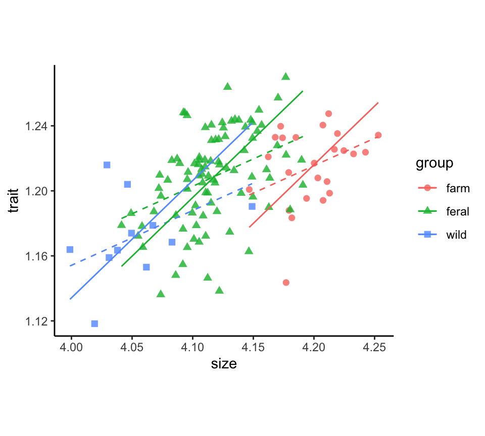
Here is the plot of size-adjusted measurements in a strip chart.
stripchart(logBrain.ma ~ category, vertical = TRUE,
  data = minkFemales, las = 1,
  method = "jitter", jitter = 0.1, pch = 16, col = "goldenrod1")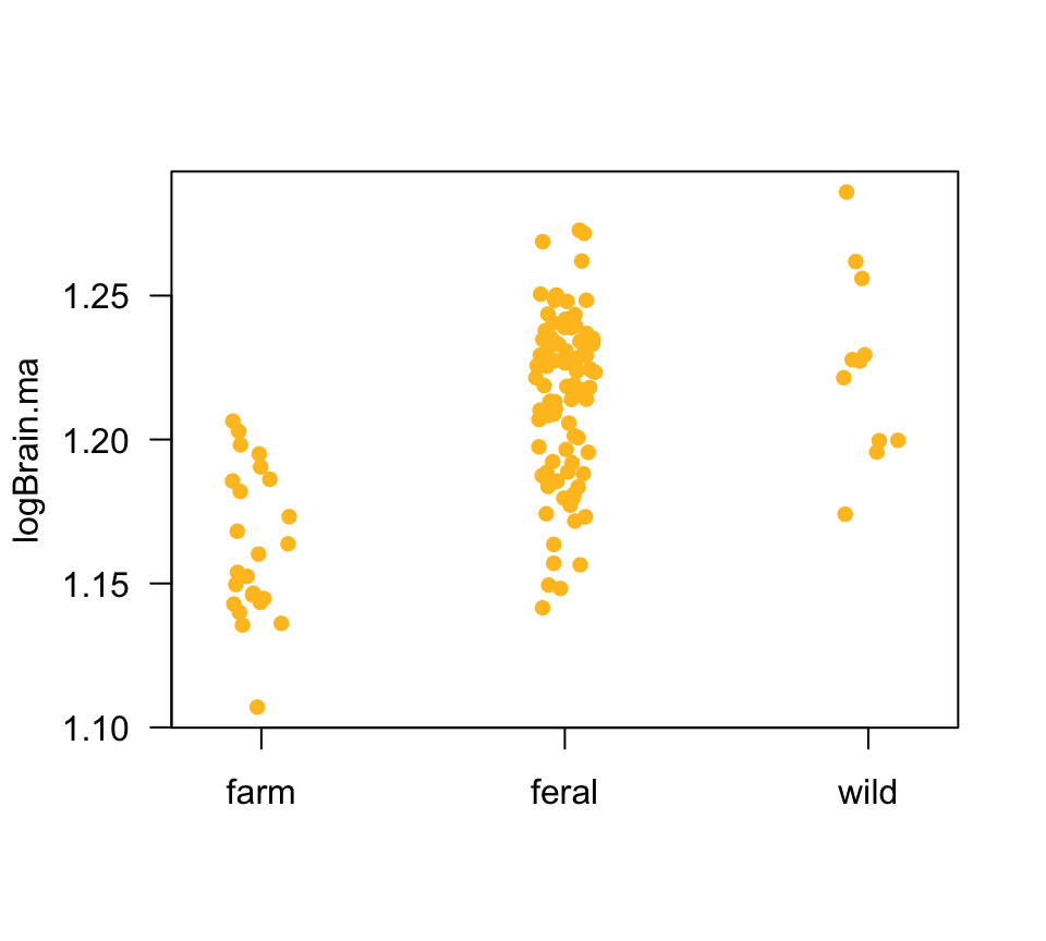
Standardized major axis regression
If trait and size cannot be transformed to the same scale (i.e., they have dissimilar variances or are not in comparable units), a modified approach uses the common principal component of the correlation matrix of trait and size instead of the covariance matrix. This is essentially equivalent to calculating the regression slope as the ratio of standard deviations of trait and size. It is sometimes referred to as “reduced major axis” regression.
The commands are the same as above except method = "SMA"
is used in the sma() command.
# Put renamed variables 'trait', 'size', and 'group' in a new data frame,
x <- data.frame(size = minkFemales$logSize, trait = minkFemales$logBrain,
                group = factor(minkFemales$category))
head(x)
## size trait group
## 1 4.207376 1.240449 farm
## 2 4.162315 1.220931 farm
## 3 4.172539 1.239722 farm
## 4 4.174080 1.232613 farm
## 5 4.179145 1.211298 farm
## 6 4.193888 1.195339 farm# Drop missing values
dat <- na.omit(x)
# `group` must be listed AFTER size in formula for this to work
z <- sma(trait ~ size + group, data = dat, method = "SMA", na.action = na.exclude)
summary(z)## Call: sma(formula = trait ~ size + group, data = dat, na.action = na.exclude,
## method = "SMA")
##
## Fit using Standardized Major Axis
##
## ------------------------------------------------------------
## Results of comparing lines among groups.
##
## H0 : slopes are equal.
## Likelihood ratio statistic : 0.8102 with 2 degrees of freedom
## P-value : 0.66691
## ------------------------------------------------------------
##
## H0 : no difference in elevation.
## Wald statistic: 52.8 with 2 degrees of freedom
## P-value : 3.432e-12
## ------------------------------------------------------------
##
## Coefficients by group in variable "group"
##
## Group: farm
## elevation slope
## estimate -2.468447 0.8773231
## lower limit -3.110643 0.7457770
## upper limit -1.826252 1.0413563
##
## H0 : variables uncorrelated.
## R-squared : 0.08099454
## P-value : 0.1777
##
## Group: feral
## elevation slope
## estimate -2.403053 0.8773231
## lower limit -3.006230 0.7457770
## upper limit -1.799876 1.0413563
##
## H0 : variables uncorrelated.
## R-squared : 0.1750054
## P-value : 3.6846e-05
##
## Group: wild
## elevation slope
## estimate -2.383230 0.8773231
## lower limit -3.059713 0.7457770
## upper limit -1.706748 1.0413563
##
## H0 : variables uncorrelated.
## R-squared : 0.08220892
## P-value : 0.39265# Common slope of the standardized major axis regression
b.sma <- z$groupsummary$Slope[1]
b.sma## [1] 0.8773231Calculate size-corrected trait values
The trait is size-adjusted to the grand mean size of all individuals.
# Copying from earlier
x <- data.frame(size = minkFemales$logSize, trait = minkFemales$logBrain,
                group = factor(minkFemales$category))

# Calculate predicted values and residuals
x <- mutate(group_by(x, group),
        groupMeanSize = mean(size, na.rm = TRUE),
        groupMeanTrait = mean(trait, na.rm = TRUE))
x$pred.sma <- b.sma * (x$size - x$groupMeanSize) + x$groupMeanTrait
x$resid.sma <- x$trait - x$pred.sma

# calculate size-adjusted values
grandMeanSize <- mean(x$size, na.rm = TRUE)
trait.sma <- b.sma * (grandMeanSize - x$groupMeanSize) +
                x$groupMeanTrait + x$resid.sma

# Save to original data frame
minkFemales$logBrain.sma <- trait.sma
Plot results
The plotted major axis lines, one for each group, represent the relationship between trait and size used in size-correction. The linear model fit (dashed lines) is included for comparison.
x$pred.lm <- predict(lm(trait ~ size + group, data = x, na.action = na.exclude))

ggplot(x, aes(x = size, y = trait, colour = group, shape = group)) +
  geom_point(size = 2, alpha = 0.8) +
  geom_line(aes(y = pred.lm), linetype = 2) +
  geom_line(aes(y = pred.sma)) +
  theme_classic() +
  theme(aspect.ratio = 0.80)
Linear mixed-effects models
Linear mixed-effects models are implemented with the
lmer() function of the lme4 package in R, and
with the lme() function of the nlme package.
These methods use restricted maximum likelihood (REML) to produce
unbiased estimates of model parameters and to test hypotheses.
lmer() is recommended here because it uses \(F\) tests with the Satterthwaite or
Kenward-Roger approximations to degrees of freedom when testing fixed
effects.
Luke
(2017; Behav Res 49:1494–1502) has shown that these approximations lead
to more accurate inference than is available in lme(),
especially when sample size is small or moderate.
Use ML (REML = FALSE) if you use likelihood ratio tests
to test fixed effects in mixed models, or if you are using using AIC and
BIC to compare models with different fixed effects. The reason is that
models with different fixed effects (such as the “full” and “reduced”
models fitted when testing a fixed effect) do not have comparable
likelihoods when fitted using REML (see the discussion
here.).
To begin, load the packages you will need. To use
lmer(), load the lmerTest package, which
includes lme4 and additional useful methods.
library(lmerTest) # for lmer() in lme4 package
library(nlme)     # for lme() in nlme package
The lmer() command expects a formula that includes fixed
as well as random effects in parentheses. For example, a model for a
single random effect B and only an intercept for a fixed
effect would looks like the following. y is the response
variable, and along with B is contained in
mydata.
z <- lmer(y ~ 1 + (1|B), data = mydata, na.action = na.exclude)In contrast, lme() expects two formulas, one for the
fixed effects and the second for the random effects. The same analysis
as the one above would look like the following:
# avoid mydata$y and mydata$B notation
z <- lme(y ~ 1, random = ~ 1|B, data = mydata, na.action = na.exclude)
In both cases the first “1” indicates that a fixed
intercept is fitted. The second part, “1|B” indicates that
a separate random intercept is to be fitted for each group identified by
the categorical variable B.
The resulting object (here named z) contains all the
results. Here are some of the most useful commands to extract results
from the z object:
summary(z)          # variances for random effects, fit metrics
plot(z)             # plot of residuals against predicted values
VarCorr(z)          # variance components for random effects
confint(z)          # lmer: conf. intervals for fixed effects and variances
intervals(z)        # lme: conf. intervals for fixed effects and variances

resid(z)            # residuals
fitted(z)           # best linear unbiased predictors (BLUPs)

anova(z, type = 1)  # lmer: test fixed effects sequentially (Type I SS)
anova(z, type = 3)  # lmer: as above but using Type III Sums of Squares
anova(z)            # lme: test fixed effects sequentially (Type I SS)
A frequent error when analyzing data with random effects is using the same labels to identify different sampling units in different groups. For example, the same number codes 1 through 5 might be used to label the 5 subplots of every plot. This will confuse R and cause frustration. Instead, use the codes a1 through a5 to label the subplots from plot “a”, b1 through b5 to label the subplots taken from plot “b”, and so on.
A random effect–repeated measures
The simplest example of a model with random effects is an observational study in which multiple measurements are taken on a random sample of individuals (or units, plots, etc) from a population. In this case “individual” is the random factor or group.
A frequent application is estimation of the repeatability of a trait or measurement. Lessels and Boag (1987, Auk 104: 116-121) define repeatability as “the proportion of variance in a character that occurs among rather than within individuals”. It can be thought of as the correlation between repeated measurements made on the same individuals.
In the example below, a numeric variable y is measured
two (or more) times on randomly sampled individuals whose identities are
recorded in the variable B. Both variables are in the data
frame mydata.
z <- lmer(y ~ 1 + (1|B), data = mydata, na.action = na.exclude)        # lme4/lmerTest package

z <- lme(y ~ 1, random = ~ 1|B, data = mydata, na.action = na.exclude) # nlme package
Use the following commands to obtain estimates of the parameters (grand mean, for the fixed part; standard deviation and variances among groups for the random part, as well as the variance of the residuals).
summary(z)
VarCorr(z)
confint(z)   # lmer: 95% confidence intervals fixed effects
intervals(z) # lme: 95% confidence intervals fixed effects
Repeatability of a measurement is calculated as r = varamong / (varamong + varwithin)
where varamong is the variance among the means of groups
(individuals, in this case), and varwithin is the variance
among repeat measurements within groups. In the output of the
VarCorr() command, the estimated variance among groups is
shown as the variance associated with the random intercepts. The
variance associated with the residual is the estimate of the
within-group variance.
To see a plot of the residual values against fitted values,
plot(z)You might notice a positive trend in the residuals, depending on the
amount of variation between repeat measurements and the number of repeat
measurements per individual in the data. To confirm what is happening,
plot the original data and superimpose the lme() fitted
(predicted) values:
stripchart(y ~ B, vertical = TRUE, pch = 1)
stripchart(fitted(z) ~ B, vertical = TRUE, add = TRUE, pch = "---")
Notice that the predicted values are smaller than the mean for
individuals having large values of y, whereas the predicted
values are larger than the mean for individuals having small values of
y. This is not a mistake. Fitting linear mixed effects
models obtains “best linear unbiased predictors” for the random effects,
which tend to lie closer to the grand mean than do the mean of the
measurements of each individual. Basically, lme() is
predicting that the “true” trait value for individuals having extreme
measurements is likely to be closer, on average, to the grand mean than
is the average of the repeat measurements. This effect diminishes the
more measurements you have taken of each individual.
visreg doesn’t work in this simple case because the
method requires at least one fixed factor in the model (not just an
intercept).
Two nested random factors
The above procedures can be extended to study designs in which sampled units are nested within other units, and there are no treatment fixed effects.
For example, a study might measure a variable y in
quadrats randomly sampled within transects. Transects are randomly
placed within woodlots, and woodlots are randomly sampled from a
population of woodlots in a region. Variable A identifies
the transect, and B indicates the woodlot. The multiple
values of y for each combination of A and
B are the quadrat measurements. This sampling design is
modeled as
z <- lmer(y ~ 1 + (1|B/A), data = mydata, na.action = na.exclude)          # lme4/lmerTest
z <- lmer(y ~ 1 + (1|B) + (1|A:B), data = mydata, na.action = na.exclude)  # Alternate formulation of same

z <- lme(y ~ 1, random = ~ 1|B/A, data = mydata, na.action = na.exclude)   # nlme
where “B/A” expresses the nesting: “woodlot, and
transect within woodlot”. In this case, random intercepts are fitted to
woodlots and to transects from each woodlot.
This same formulation could be used to model the results of a
half-sib breeding design in quantitative genetics, where multiple
offspring are measured per dam (A), and multiple dams are
mated to each sire (B).
Take special care to label sampling units (e.g., transects) uniquely. For example, if you have 5 transects in each woodlot, don’t give them the same labels 1 through 5 in each woodlot. Instead, label those from woodlot 1 as w1.1 through w1.5, and those from woodlot 2 as w2.1 through w2.5. Otherwise R won’t compute the correct quantities.
In this model there are no treatment fixed effects to test, so the
anova() command will not accomplish anything.
Randomized block design
A randomized complete block (RCB) design is like a paired design but for more than two treatments. In the typical RCB design, every treatment is applied exactly once within every block. This yields a single value for the response variable from every treatment by block combination. In this case it is not possible to include an interaction term between treatment and block. In field experiments, blocks are typically experimental units (e.g., plots) grouped by location or in time. In lab experiments blocks may be separate environment chambers, or separate shelves within a single chamber. Used this way, blocks aren’t true random samples from a population of blocks. Nevertheless blocks are usually modeled as random effects when the data are analyzed.
The data from a RCB experiment include the response variable
y, a categorical variable A indicating the
treatment (fixed effect), and a categorical variable B
indicating block (random effect). If you plan to use visreg
to visualize the scatter of the data around the model fits, convert
A and B to factors before fitting.
“Subject” is the random effect in human or animal experiments in
which each fixed treatment is applied once (in random order) to every
individual subject or animal. These are also called “subjects by
treatment” repeated measures designs, and they are often analyzed in the
same way as RCB designs. Here, each treatment is assigned to every
subject in random order. The analysis assumes that there is no
carry-over between treatments: earlier measurements made on a subject
under one treatment should not influence later measurements taken on the
same subject in another treatment. The categorical variable
B indicates the identities of the subjects.
z <- lmer(y ~ A + (1|B), data = mydata, na.action = na.exclude)         # lme4/lmerTest package

z <- lme(y ~ A, random = ~ 1|B, data = mydata, na.action = na.exclude)  # nlme package
The formulas are similar to that for a single random effect except
that now the fixed part of the model includes the fixed effect
A as an explanatory variable. The random part of the model
again fits an intercept to each of the random groups defined in
B (subjects or blocks).
You can use interaction.plot to view how the mean
y changes between treatment levels of A
separately for each level of B. Parallel lines would
indicate a lack of an interaction between A and
B. The drawback of this function is that it does not show
the data (not a problem if you have just one data point for each
combination of categories of A and B).
interaction.plot(A, B, y)The visreg() function seems to work in this case to
visualize model fits to data (although it won’t include the confidence
intervals). If A is the fixed (treatment) effect and
B is the random effect, try one of the following.
visreg(z, xvar = "A")
visreg(z, xvar = "A", by = "B", scales=list(rot = 90))
To obtain estimates of the fixed effects and variance components, with confidence intervals,
summary(z)
VarCorr(z)
confint(z)   # lmer
intervals(z) # lme
Use emmeans to obtain model-based estimates of the
treatment (A) means.
# uses kenward-roger degrees of freedom method
emmeans(z, "A", data = mydata)

# uses satterthwaite degrees of freedom method
emmeans(z, "A", data = mydata, lmer.df = "satterthwaite")
Use the anova() command to test the fixed effects (the
grand mean and the treatment A).
anova(z, type = 1)   # lmer: test fixed effects sequentially (Type I SS)
anova(z, type = 3)   # lmer: as above but using Type III Sums of Squares
anova(z)             # lme: test fixed effects sequentially (Type I SS)
A fixed and a random factor
The approach to a factorial design with one fixed and one random factor is similar to the randomized complete block design except that each combination of levels of the fixed and random effect may be replicated.
Two-factor ANOVA is more complex when one of the factors is random because random sampling of groups adds extra sampling error to the design. This sampling error adds noise to the measurement of differences between group means for the fixed factors that interact with the random factor.
If A is the fixed factor and B is the
random factor, use the following if you want to include the interaction
between A and B. An interaction between a
fixed and a random factor is a random effect.
z <- lmer(y ~ A + (1|B/A), data = mydata, na.action = na.exclude)        # lme4/lmerTest package

z <- lme(y ~ A, random = ~ 1|B/A, data = mydata, na.action = na.exclude) # nlme package
The corresponding formulas when there is no interaction term are
z <- lmer(y ~ A + (1|B), data = mydata, na.action = na.exclude)          # lme4/lmerTest package

z <- lme(y ~ A, random = ~ 1|B, data = mydata, na.action = na.exclude)   # nlme package
To plot the residuals against the fitted values,
plot(z)To test the fixed effects, use
anova(z, type = 1)   # lmer: test fixed effects sequentially (Type I SS)
anova(z, type = 3)   # lmer: as above but using Type III Sums of Squares
anova(z)             # lme: test fixed effects sequentially (Type I SS)
Use emmeans to obtain model-based estimates of the fixed
factor (A) means.
emmeans(z, "A", data = mydata)A numeric and a random factor
In the examples below, y is the response variable,
x is the numeric explanatory variable, and B
identifies the random groups, with all variables in a data frame
mydata. x is always modeled as a fixed
effect.
The simplest model for linear regression in multiple random groups assumes equal slopes within each group. In this case, only a random intercept is modeled in each group.
z <- lmer(y ~ x + (1|B), data = mydata, na.action = na.exclude)        # lme4/lmerTest package

z <- lme(y ~ x, random = ~ 1|B, data = mydata, na.action = na.exclude) # nlme package
If slopes and intercepts both vary among random groups, then the
model includes an interaction between x and B,
which is a random effect.
z <- lmer(y ~ x + (x|B), data = mydata, na.action = na.exclude)        # lme4/lmerTest package

z <- lme(y ~ x, random = ~ x|B, data = mydata, na.action = na.exclude) # nlme package
To obtain estimates of the fixed effects and variance components, with confidence intervals,
summary(z)
VarCorr(z)
confint(z)   # lmer
intervals(z) # lme
Use emmeans to obtain model-based estimates of the
treatment (A) means.
emmeans(z, "A", data = mydata)Use the anova() command to test the fixed effects (the
grand mean and the treatment A).
anova(z, type = 1)   # lmer: test fixed effects sequentially (Type I SS)
anova(z, type = 3)   # lmer: as above but using Type III Sums of Squares
anova(z)             # lme: test fixed effects sequentially (Type I SS)
Two random factors–factorial
Use lmer() in the lmerTest package if
fitting models to a factorial design with two crossed random factors,
A and B.
z <- lmer(y ~ (1|A) + (1|B), data = mydata, na.action = na.exclude)           # without interaction

z <- lmer(y ~ (1|A) + (1|B) + (1|A:B), data = mydata, na.action = na.exclude) # with interaction
Accomplishing the same goal using lme() in the
nlme package is more challenging, and is explained
here).
To obtain estimates of the fixed effects and variance components, with confidence intervals,
summary(z)
VarCorr(z)
confint(z)   # lmer
intervals(z) # lme
In this model there are no fixed effects to test, so the
anova() command will not accomplish anything.
Two fixed and a random–split plot
A basic split plot design has two treatment variables, which are
fixed factors, A and B. One of these is
applied to whole plots (ponds, subjects, etc) as in a completely
randomized design. All levels of the second factor B are
applied to subplots within every plots. For example, if there are two
treatment levels of factor B (e.g., a treatment and a
control), then each plot is split in two; one of the treatments is
applied to one side (randomly chosen) and the second is applied to the
other side. In this case, each side of a given plot yields a single
value for the response variable. Because levels of B are
repeated over multiple plots within each level of A, it is
possible to investigate the effects of each treatment variable as well
as their interaction.
Let “plot” refer to the variable identifying the random plot (pond, subject, etc). The response variable is modeled as
z <- lmer(y ~ A * B + (1|plot), data = mydata, na.action = na.exclude)        # lme4/lmerTest package

z <- lme(y ~ A * B, random = ~ 1|plot, data = mydata, na.action = na.exclude) # nlme package
Notice that “A * B” is shorthand for
“A + B + A:B”, where the last term is the interaction
between A and B.
Plot the residuals against the fitted values in a partial check of assumptions.
plot(z)To visualize the model fit, visreg() seems to work in
this case, since there is only one random factor.
visreg(z, xvar = "A", by = "B", scales=list(rot = 90))Use emmeans to generate model-based fitted means for
treatments.
# means of each treatment combination
emmeans(z, c("A", "B"), data = mydata)

# means of "A" treatment levels averaged over levels of "B"
emmeans(z, c("A"), data = mydata)
Use the anova() command to test the fixed effects (the
grand mean and the treatment A).
anova(z, type = 1)   # lmer: test fixed effects sequentially (Type I SS)
anova(z, type = 3)   # lmer: as above but using Type III Sums of Squares
anova(z)             # lme: test fixed effects sequentially (Type I SS)
Generalized linear models
Generalized linear models for fixed effects are implemented using
glm() in R. The glm() command is similar to
the lm() command, used for fitting linear models, except
that an error distribution and link function must be specified using the
family argument. For example, to model a binary response
variable (0 and 1 data), specify a binomial error distribution and the
logit (logistic) link function.
# Logistic regression
z <- glm(y ~ x, family = binomial(link="logit"), data = mydata, na.action = na.exclude)

# Log-linear regression
z <- glm(y ~ x, family = poisson(link="log"), data = mydata, na.action = na.exclude)
The method assumes that the error distribution is correctly specified, and is sensitive to overdispersion (see below).
For count data, the poisson error distribution and the log link function are often used. Typically, however, the error variance for count data is greater than (often much greater than) that specified by the poisson distribution (“overdispersion”). If the variances of the errors in the data are not in agreement with the binomial or poisson distributions, use the following instead. The output will include an estimate of the dispersion parameter (a value greater than one indicates overdispersion, whereas a value less than 1 indicates underdispersion).
# Logistic regression
family = quasibinomial(link = "logit")

# Log-linear regression
family = quasipoisson(link = "log"))
Type help(family) to see other error distributions and
link functions that can be modeled using glm().
The resulting object (which I’ve named z) is a
glm() object containing all the results. Here are some of
the most useful commands used to extract results from the
glm() object:
summary(z)                    # parameter estimates and overall model fit
coef(z)                       # model coefficients
resid(z)                      # deviance residuals
predict(z)                    # predicted values on the transformed scale
predict(z, se.fit = TRUE)     # Includes SE's of predicted values
fitted(z)                     # predicted values on the original scale
anova(z, test = "Chisq")      # Analysis of deviance - sequential
anova(z1, z2, test = "Chisq") # compare fits of 2 models, "reduced" vs "full"
anova(z, test = "F")          # Use F test for gaussian, quasibinomial or quasipoisson
“Deviance residuals” are not the same as ordinary residuals in linear models. They are a measure of the goodness of fit of the model to each data point. Each residual can be thought of as the contribution of the corresponding data point to the residual deviance (given in the analysis of deviance table).
There is no plot(z) method for glm() model
objects. If you enter plot(z), the resulting plots will
look strange and won’t be easy to interpret. R is using the
plot() function for lm() model objects, and
they aren’t valid for glm() objects. Instead, it is more
useful to visualize the data by adding the fitted curves or means onto
scatter plots or other graphs that show the data.
Use a loess curve to check if the fitted curve is reasonably close to the fitted logistic or log-linear regression curves.
ggplot(mydata, aes(x, y)) +
  geom_point(size = 2, col = "firebrick") +
  geom_smooth(method = "loess", size = 1, col = "black", span = 0.8) +
    theme_classic()
Binary data (logistic regression)
Below, x is a continuous numeric explanatory variable
and y is binary (0 or 1).
z <- glm(y ~ x, family = binomial(link="logit"), data = mydata, na.action = na.exclude)Use visreg with the scale = "response"
argument to see the fitted relationship on the original scale.
visreg(z, xvar = "x", ylim = range(y), rug = 2, scale = "response") Use visreg() to visualize the model fit on the
transformed scale (the function uses predict(z) to generate
the result). The pseudo-data shown are “working values”, which R uses
under the hood to obtain the maximum likelihood estimates of the model
coefficients.
visreg(z, xvar = "x") In base R, use fitted(z) to plot the predicted values
corresponding to your data points on the original scale of the data.
plot(jitter(y, amount = 0.02) ~ x, data = mydata)
yhat <- fitted(z)
lines(yhat[order(x)] ~ x[order(x)])
Use summary to view the parameter estimates (slope and
intercept) on the logit scale, along with standard errors. Note that
P-values in the summary() output are based on a
normal approximation and are not accurate for small to moderate sample
sizes – use the log likelihood ratio test instead (see
anova() below).
summary(z)A method for calculating likelihood-based confidence intervals for parameters is available in the MASS library. The same package will also estimate the LD50.
library(MASS)
confint(z, level = 0.95)

# LD50 for a dose-response curve
dose.p(z, p = 0.50)
Use anova() to obtain the analysis of deviance table.
This provides log-likelihood ratio tests of the most important
parameters. Model terms are tested sequentially, and so the
results will depend on the order in which variables are entered into the
model formula. If you are using the quasibinomial or quasipoisson error
distributions, use test = "F" argument instead.
anova(z, test = "Chisq")

# Use this instead for quasibinomial error distributions
anova(z, test = "F")
Count data (log-linear regression)
Below, x is a continuous numeric explanatory variable
and y is binary (0 or 1).
Use the quasibinomial or quasipoisson error distributions to estimate the dispersion parameter. If the dispersion parameter differs greatly from 1, then the variance assumptions of glm() is not met, and the model should be fitted using quasipoisson distributions instead. This will lead to more reliable standard errors for parameters and more accurate P-values in tests.
z <- glm(y ~ x, family = poisson(link="log"), data = mydata, na.action = na.exclude)

z <- glm(y ~ x, family = quasipoisson(link="log"), data = mydata, na.action = na.exclude)
Use visreg with the scale = "response"
argument to see the fitted relationship on the original scale.
visreg(z, xvar = "x", ylim = range(y), rug = 2, scale = "response") Use visreg() to visualize the model fit on the
transformed scale (the function uses predict(z) to generate
the result). The pseudo-data shown are “working values”, which R uses
under the hood to obtain the maximum likelihood estimates of the model
coefficients.
visreg(z, xvar = "x") In base R, use fitted(z) to plot the predicted values
corresponding to your data points on the original scale of the data.
plot(jitter(y, amount = 0.02) ~ x, data = mydata)
yhat <- fitted(z)
lines(yhat[order(x)] ~ x[order(x)])
Use summary to view the parameter estimates (slope and
intercept) on the logit scale, along with standard errors. Note that
P-values in the summary() output are based on a
normal approximation and are not accurate for small to moderate sample
sizes – use the log likelihood ratio test instead (see
anova() below).
summary(z)Use the MASS package to calculate likelihood-based confidence intervals for parameters.
library(MASS)
confint(z, level = 0.95)
Use anova() to carry out log-likelihood ratio tests of
the most important parameters. Model terms are tested
sequentially, and so the results will depend on the order in
which variables are entered into the model formula.
If you are using the quasipoisson error distributions, use
test = "F" argument. This is because the quasi-likelihood
is not a real likelihood and the generalized log-likelihood ratio test
is not accurate.
anova(z, test = "Chisq")

# Use this instead for quasipoisson error distributions
anova(z, test = "F")
Categorical explanatory variable
Generalized linear models can also be fitted to data when the
explanatory variable is categorical rather than continuous. This is
analogous to single-factor ANOVA in lm(), but here the
response variable is binary or has three or more categories.
The glm() models are as follows. A is the categorical
variable identifying treatment groups.
z <- glm(y ~ A, family = binomial(link="logit"), data = mydata, na.action = na.exclude)
z <- glm(y ~ A, family = poisson(link="log"), data = mydata, na.action = na.exclude)
z <- glm(y ~ A, family = quasipoisson(link="log"), data = mydata, na.action = na.exclude)
As in lm(), it may be useful to order the different
groups (categories of A) so that a control group is first,
followed by treatment groups. This can help interpretation of the model
parameters. For example, if there are 4 groups in A and
group “c” is the control group, set the order of the group
A <- factor(A, levels=c("c","a","b","d"))Use emmeans to generate model-based fitted means for
treatments on the original scale.
emmeans(z, c("A"), data = mydata, type = "response")2x2 contingency tables
This is a special case of the contingency table when the explanatory variable is binary (1 and 0, or treatment and control) and so is the response response (1 and 0, or success and failure). Here, “a”, “b”, “c”, and “d” refer to table frequencies. The convention is to have “a” in the upper left corner of the table corresponding to the number of successes in the treatment group.
| treatment | control | |
| success | a | b |
| failure | c | d |
The corresponding data for each individual are contained in the
variables treatment and response in the data
frame mydata. The first 10 rows of mydata
might look like the following:
   treatment response
1    control  success
2    control  success
3  treatment  failure
4  treatment  success
5    control  success
6  treatment  success
7  treatment  failure
8  treatment  success
9  treatment  failure
10   control  failure
The glm() model is as follows. Use
response == "success" and
treatment == "treatment" in the model formula to ensure
that we are modeling probability of success under treatment (1) and
control (0) conditions.
z <- glm(response == "success" ~ treatment == "treatment",
         family = binomial(link="logit"), data = mydata, na.action = na.exclude)
summary(z)
anova(z, test = "Chisq")
Odds ratios for 2x2 tables
Odds ratio is a commonly used statistic to measure the strength of association between two binary variables in a 2x2 design. Referring to the contingency table above, the odds ratio of success in the treatment group relative to the control group is calculated as
OR <- (a/c) / (b/d)A problem arises if one of the four table frequencies is 0, which can create an odds ratio of 0 or infinity. Although not optimal, a standard fix is to add 0.5 to each cell of the table before calculating OR.
Alternatively, we can use glm() to obtain the odds ratio
as follows. The coefficient of the model corresponding to the treatment
variable (obtained using summary(z)) is the estimate of log
odds ratio.
z <- glm(response == "success" ~ treatment == "treatment",
         family = binomial(link="logit"), data = mydata, na.action = na.exclude)
summary(z)
coef(z)[2]          # log odds ratio
confint(z)[2,]      # 95% CI for log odds ratio
exp(coef(z)[2])     # odds ratio
exp(confint(z)[2,]) # 95% CI for odds ratio
Modeling rxc contingency tables
Larger contingency tables having r rows and c columns can also be
modeled using glm(). If the response variable has only two
cateories “success” = 1 and “failure” = 0 (i.e., r = 2), then use
analogous model to that used above for 2x2 tables. Here, A
is a categorical variable having levels a1, a2, a3, etc, in
mydata.
z <- glm(response == "success" ~ A, family = binomial(link="logit"),
         data = mydata, na.action = na.exclude)
summary(z)
anova(z, test = "Chisq")
Now we model the interaction between the grouping variable
A and the outcome variable. First make a “flat” frequency
table as follows (see the Graphs & Tables page at R tips for
hints).
 A outcome freq
a1     red    5
a2     red   15
a3     red   25
a1    pink    5
a2    pink   15
a3    pink   25
a1   white    5
a2   white   15
a3   white   25
Then fit these frequencies with a glm() model and the
log link function. The linear predictors of the model includes the
grouping variable A, the outcome variable
outcome, and their interaction:
z <- glm(freq ~ A * outcome, family = poisson(link = "log"), data = mydata, na.action = na.exclude)
summary(z)
anova(z, test="Chisq")
We are interested in the interaction between A
and outcome, rather than coefficients for the main effects
for A and outcome. The interaction measures
the extent to which probability of each outcome depends on
A.
Binomial proportion and test
Generalized linear models can be used to estimate proportion of successes \(p\) and carry out a binomial test of the goodness of fit of the observed frequencies of successes and failures to that expected by a null model.
For example, if data on the success or failure of individuals are
stored in the variable A in mydata (i.e.,
whereA looks like
A <- c("success", "success", "failure", "success", "failure",...)),
then estimate the proportion of successes \(p\) using
z <- glm(A=="success" ~ 1, family=binomial(link= "logit"),
      data = mydata, na.action = na.exclude)
coef(z)                         # estimate of p on logit scale
exp(coef(z))/(exp(coef(z)) + 1) # estimate of p on original scale
confint(z)                      # 95% CI for p on logit scale
exp(confint(z))/
  (exp(confint(z)) + 1)         # 95% CI for p on original scale
A likelihood ratio test of the null hypothesis that \(p = 0.5\) is obtained as
z1 <- glm(A=="success" ~ 1, family=binomial(link= "logit"), data = mydata)
z0 <- glm(A=="success" ~ 0, family=binomial(link= "logit"), data = mydata)
anova(z0, z1, test = "Chisq")
To test the null hypothesis that \(p =
0.25\) (or another value not 0.5), use the offset()
function.
p0 <- 0.25

# put p0 into mydata
mydata$nullexp <- exp(p0)/(p0) + 1)

z1 <- glm((A=="success" ~ 1 ~ offset(nullexp) + 1,
           family=binomial(link= "logit"), data = mydata)
z0 <- glm((A=="success" ~ 1 ~ offset(nullexp) + 0,
           family=binomial(link= "logit"), data = mydata)
anova(z0, z1, test = "Chi")
Goodness of fit test
Compare observed and expected frequencies using the log likelihood
ratio test as follows. Let A be a categorical variable
having three categories (e.g., “red”, “pink”, “white”) in the data frame
mydata. Assume that you want to test the null hypothesis
that the frequencies of the three color types occur in a 1:2:1 ratio
(e.g., as predicted by a genetic model). Begin by ordering the
categories.
mydata$A <- factor(mydata$A, levels = c("red", "pink", "white"))
observed <- table(mydata$A)    # observed frequencies
p0 <- c(0.25, 0.5, 0.25)       # proportions corresponding 1:2:1
expected <- p0 * sum(observed) # expected frequencies
groups <- levels(mydata$A)
z <- glm(observed ~ offset(log(expected)) + groups, family=poisson(link = "log"))
anova(z, test = "Chisq")
Model selection
R includes a number of model selection tools to evaluate and compare
the fits of alternative models to data. Most of the methods shown below
work on lm() objects as well as
lme(), glm(), nl(), gls() and gam()
objects.
Stepwise search for best model
stepAIC(), a command in the MASS library, will
automatically carry out a restricted search for the “best” model, as
measured by either AIC or BIC (Bayesian Information criterion) (but not
AICc, unfortunately). stepAIC accepts both categorical and
numerical variables. It does not search all possible subsets of
variables, and so cannot provide a list of all models that fit the data
nearly equally well as the best model. Rather, it searches in a specific
sequence determined by the order of the variables in the formula of the
model object. (This can be a problem if a design is severely unbalanced,
in which case it may be necessary to try more than one sequence.) The
search sequence obeys restrictions regarding inclusion of interactions
and main effects, such as
- A quadratic term \(\chi^2\) is not fitted unless x is also present in the model
- The interaction a:b is not fitted unless both a and b are also present
- The threeway interaction a:b:c is not fitted unless all two-way interactions of a, b, c, are also present
and so on. stepAIC() focuses on finding the best model,
and it does not yield a list of all the models that are nearly
equivalent to the best.
To use stepAIC you will need to load the MASS
library
library(MASS)To begin, fit a “full” model with all the variables of interest included. To simplify this procedure, put the single response variable and all the explanatory variables you want to investigate into a new data frame. Leave out all variables you are not interested in fitting. There’s no need to include variables representing interactions. Then you can use one of the following shortcuts:
full <- lm(y ~., data = mydata)     # additive model, all variables
full <- lm(y ~(.)^2, data = mydata) # includes 2-way interactions
full <- lm(y ~(.)^3, data = mydata) # includes 3-way interactions
To use stepAIC(), include the fitted model output from
the previous lm() command,
z <- stepAIC(full, direction="both")The output will appear on the screen. The output object (here called
z) stores only lm() output from fitting the
best model identified by stepAIC. To obtain results from
fitting the best model, use the following commands.
summary(z)
plot(z)
anova(z)
logLik(z) # include df
AIC(z)    # AIC score
Now, to interpret the output of stepAIC(). Start at the
top and follow the sequence of steps that the procedure has carried out.
First, it fits the full model you gave it and prints the AIC value. Then
it lists the AIC values that result when it drops out each term, one at
a time, leaving all other variables in the model. (It starts with the
highest-order interactions, if you have included any.) It picks the best
model of the bunch tested (the one with the lowest AIC) and then starts
again. At each iteration it may also add variables one at a time to see
if AIC is lowered further. The process continues until neither adding
nor removing any single term results in a lower AIC.
To use the BIC criterion with stepAIC, change the option
k to the log of the sample size
z <- stepAIC(full, direction = "both", k = log(nrow(mydata)))Search with dredge
The dredge() command in the MuMIn package
carries out a computationally expensive search for the best model,
ranking the results by AIC or AICc. The search sequence obeys the same
restrictions as stepAIC() (i.e., interactions between
variables are not fitted without their main effects; see above).
library(MuMIn)To begin, enter a formula for the “full” or global model with all the
variables of interest included. To simplify this procedure, put the
single response variable and all the explanatory variables you want to
investigate into a new data frame. Leave out all variables you are not
interested in fitting. There’s no need to include variables representing
interactions. Then you can use one of the following shortcuts. Be sure
to start with options(na.action = "na.fail").
options(na.action = "na.fail")
full <- lm(y ~., data = mydata)     # additive model, all variables
full <- lm(y ~(.)^2, data = mydata) # includes 2-way interactions
full <- lm(y ~(.)^3, data = mydata) # includes 3-way interactions
Now run the dredge() command on the full model, saving
the results in a model selection object (here, named z).
You can choose to rank on AIC, AICc, or BIC.
z <- dredge(full, rank = "AICc")Use the following commands to extract model selection output.
print(z)                                  # Model selection table
print(z[z$delta < 5])                     # Tabulate only models with AIC difference < 5
Weights(z)                                # AIC weights all models
Weights(z[z$delta < 5])                   # Include only models with AIC difference < 5
get.models(z, subset=delta<5)             # Extract the models having AIC difference < 5
get.models(z, subset = 1)[[1]]            # Extract single best model (yields lm object)

z <- lm(get.models(z, subset = 1)[[1]], data = mydata) # Fit best model
summary(model.avg(z, subset = delta < 2))              # model averaging
All subsets regression
The leaps() command in the leaps library
carries out an exhaustive search for the best subsets of the explanatory
variables for predicting a response variable. The method is only suited
to analyzing numeric variables, not categorical variables (a
variable having just two categories can be recoded as a numeric variable
with indicator 0’s and 1’s). To begin, load the leaps
library,
library(leaps)To prepare your data for analyzing, create a new data frame that contains only the explanatory variables you wish to include in the analysis. Don’t include the response variable or other variables in that data frame. Any interaction terms to fit will need to be added manually.
x <- mydata[ ,c(2,5,6,7,11)]
x$x1x2 <- x$x1 * x$x2        # interaction between x1 and x2
Then run leaps. Models are compared using Mallow’s Cp rather than AIC, but the two quantities are related. We can compute AIC ourselves later.
z <- leaps(x, y, names=names(x)) # note that x comes before yBy default, the resulting object (here called z) will contain the
results for the 10 best models for each value of p, the number of
predictors, according to the criterion of smallest Cp.
To increase the number of models saved for each value of p to 20,
for example, modify the nbest option.
z<-leaps(x, y, names = names(x), nbest = 20)Additional useful commands:
plot(z$size, z$Cp)          # plot <i>C<sub>p</sub></i> vs number of predictors, <i>p</i>
lines(z$size, z$size)       # adds the line for <i>C<sub>p</sub> = p</i>
i <- which(z$Cp==min(z$Cp)) # finds the model with smallest <i>C<sub>p</sub></i>
vars <- which(z$which[i,])  # id variables of best model
At the end of this section is a home-made (and rather slow)
leaps2aic() command that will calculate additional
quantities of interest from the leaps output. To use it,
copy and paste the text into your R command window (you will need to do
this only once in a session). These calculations assume that the the set
of saved models from leaps includes that model having the
lowest AICc and AIC, which is likely. However, the leaps
output might not include all runners up (to be safe, increase the number
of models saved using the nbest option in
leaps). leaps2aic computes differences in AIC
(AIC relative to the best) as well as differences in AICc (AIC adjusted
for small sample size) and BIC (Bayesian Information Criterion).
To use the leaps2aic() command, make certain that the
arguments x, y and z are exactly
the same as the ones you passed to the leaps() command
immediately beforehand. y is the response variable,
x is the data frame containing the explanatory variables,
and z is the saved output object from the
leaps() command.
z1 <- leaps2aic(x, y, z)
z1[,c("model","AICc", "AIC")] # prints model and AIC differences
The leaps package also includes the command
regsubsets(), which has the advantage of a formula method,
but the output is not as functional.
z <- regsubsets(y ~ x1 + x2 + x3, data = mydata)
summary(z)
plot(z)
Here is the leaps2aic() function.
leaps2aic <- function(x,y,z){
  # Calculate AIC and AICc for every model stored in "z", the
  # output of "leaps". This version sorts the output by AICc.
  # Requires the same x and y objects inputted to "leaps"
  rows <- 1:length(z$Cp)
  for(i in 1:nrow(z$which)){
    vars <- which(z$which[i,])
    newdat <- cbind.data.frame(y, x[,vars])
    znew <- lm(y~., data = newdat)
    L <- logLik(znew)
    aL <- attributes(L)
    z$model[i] <- paste(z$label[-1][vars],collapse=" + ")
    z$p[i] <- z$size[i]  # terms in model, including intercept
    z$k[i] <- aL$df      # parameters (including sigma^2)
    z$AIC[i] <- -2*L[1] + 2*aL$df
    z$AICc[i] <- -2*L[1] + 2*aL$df + (2*aL$df*(aL$df+1))/(aL$nobs-aL$df-1)
    z$BIC[i] <- -2*L[1] + log(aL$nobs)*aL$df
    }
  z$AIC <- z$AIC - min(z$AIC)
  z$AICc <- z$AICc - min(z$AICc)
  z$BIC <- z$BIC - min(z$BIC)
  result <- do.call("cbind.data.frame",
             list(z[c("model","p","k","Cp","AIC","AICc","BIC")],
             stringsAsFactors=FALSE))
  result <- result[order(result$AICc),]
  rownames(result) <- 1:nrow(result)
  newdat <- cbind.data.frame(y,x)
  print(summary( lm( as.formula(paste("y ~ ",result$model[1])),
             data=cbind.data.frame(y, x) )))
  return(result)
  }
Fit a nonlinear model
The nls() command in R allows fitting of nonlinear
relationships between a response variable and one or more explanatory
variables using for nonlinear least squares. Table 20.1 in Crawley’s The
R book lists a variety of nonlinear functions useful in biology.
Examples of nonlinear functions include
the power function,
\(y = ax^b\) (when y intercept is 0)
\(y = a + bx^c\) (when y intercept is not zero)
the exponential function
\(y = ab^x\) (basic version)
\(y = ab^{cx+d}\) (more flexible)
the Michaelis-Menten function
\(y = ax/(b+x)\) (when \(y\) intercept is 0)
\(y = a + bx/(c+x)\) (when \(y\) intercept is not zero)
Fitting models with nls
Unlike lm(), nls requires that the formula
statement includes all parameters, including an intercept if you want
one fitted. Whereas in lm() you would write the formula for
linear regression as
y ~ xto fit the same model in nls you would instead write the
formula as
y ~ a + b*xwhich includes “a” for the intercept and “b” for the slope. Including
them in the formula tells the nls() function what to
estimate.
To fit a power function to the data, the complete nls()
command would be
z <- nls(y ~ a * x^b, data = mydata, start = list(a=1, b=1))Note that nls requires that you provide reasonable
starting values for the parameters, in this case “a” and “b”, so that it
knows where to begin searching. The program will then run through a
series of iterations that bring it closer and closer to the least
squares estimates of the parameter values. Your starting values don’t
have to be terribly close, but the program is more likely to succeed in
finding the least squares estimates the closer you are.
The resulting object (which I’ve named z) is an nls
object containing all the results. You use additional commands to
pull out these results. Here are some of the most useful commands to
extract results from the lm() object:
summary(z)             # parameter estimates and overall model fit
coef(z)                # model coefficients (means, slopes, intercepts)
confint(z)             # confidence intervals for parameters

resid(z)               # residuals
fitted(z)              # predicted values

predict(z, newdata=x1) # predicted values for new observations
anova(z1, z2)          # compare fits of 2 models, "full" vs "reduced"
logLik(z)              # log-likelihood of the parameters and df
AIC(z)                 # Akaike Information Criterion
BIC(z                  # Bayesian Information Criterion
If nls has difficulty finding the least squares
estimates, it may stop before it has succeeded. For example, it will
stop and print an error if it runs out of iterations before it has
converged on the solution (by default, the maximum number of iterations
allowed is 50). You can help it along by increasing the number of
iterations using the “control” option,
z <- nls(y ~ a * x^b, data = mydata, start = list(a=1,b=1),
               control = list(maxiter=200, warnOnly=TRUE)))
The control option warnOnly=TRUE ensures that when the
program stops prematurely, it prints a warning rather than an error
message. The difference is that with a warning you get to evaluate the
fit of the not-yet-converged model stored in the model object (here
stored in z). Type ?nls.control to see other
options.
Fit a cubic spline
The function gam() allows estimation of a function,
f, relating a response variable Y to a continuous
explanatory variable X,
Y = f(X) + random error
For example, data on individual fitness, such as survival or
reproductive success (Y), may be obtained to estimate the
form of natural selection f on a trait X. In this
case f is a “fitness function”.
A cubic spline can be used to estimate f, which may take any smooth form that the data warrant. The cubic spline is a type of generalized additive model (gam). As in the case of generalized linear models, the random errors may have a distribution that is normal, binomial, poisson, or otherwise. The advantage of the spline method is that it is flexible and avoids the need to make prior assumptions about the shape of f. See Schluter (1988, Evolution 42: 849–861; reprint) for a more detailed explanation of its use in estimating a fitness function.
Key to fitting the data with a cubic spline is the choice of smoothing parameter that controls the “roughness” of the fitted curve. A small value for the smoothing parameter (close to 0) will lead to a very wiggly curve that passes close to each of the data points, whereas a large value for the smoothing parameter is equivalent to fitting a straight line through the data. In the procedure used here, the smoothing parameter is chosen as that value minimizing the generalized cross-validation (GCV) score. Minimizing this score is tantamount to maximizing the predictive ability of the fitted model.
To begin, load the built-in mgcv library in R,
library(mgcv)The following command fits a cubic spline to the relationship between
a response variable y and a single continuous variable x,
both of which are columns of the data frame, mydata. The
method will find and fit the curve with a smoothing parameter that
minimizes the GCV score. If the response variable is binary, such as
data on survival (0 or 1), then a logit link function should be
used.
z <- gam(y ~ s(x), data = mydata, family = binomial(link = "logit"),
                      method = "GCV.Cp")
Use instead family=poisson(link = "log") for poisson
data and family=gaussian(link = "identity") for normal
errors.
The results are stored in the fitted gam object, here
called z. To extract results use the following
commands.
summary(z)   # regression coefficients
fitted(z)    # predicted (fitted) values on original scale
predict(z)   # predicted values on the logit (or log, etc) scale
plot(z)      # the spline on the logit (or log, etc) scale
residuals(z, type = "response")  # residuals
Other useful results stored in the gam object:
z$sp         # "best" value for the smoothing parameter
z$gcv.ubre   # the corresponding (minimum) GCV score
sum(z$hat)   # effective number of parameters of fitted curve
To plot predicted values with Bayesian standard errors (plotted on the logit or log scale if residuals are binomial or poisson).
plot(z, se = TRUE, seWithMean=TRUE) # plus or minus 2 standard error
plot(z, se = 1, seWithMean=TRUE)    # plus or minus 1 standard error
To plot predicted values with standard errors on the original scale, in the case of non-normal errors, supply the appropriate inverse of the link function. For example,
# Poisson (count) data
plot(z, se = 1, seWithMean = TRUE, rug = FALSE, shift = mean(predict(z)),
        trans = exp)
# Binary data
plot(z, se = 1, seWithMean = TRUE, rug = FALSE, shift = mean(predict(z)),
        trans = function(x){exp(x)/(1+exp(x))})
To plot predicted values for nicely spaced x-values, not necessarily
the original x-values, with 1 standard error for prediction above and
below, use this modified procedure instead. The commands below assume
that your variables are named x and y and are
in a data frame named mydata.
newx <- seq(min(mydata$x), max(mydata$x), length.out = 100)
z1 <- predict(z, newdata=list(x = newx), se.fit = TRUE)
invlogit <- function(x){exp(x)/(exp(x) + 1)}
yhat <- invlogit(z1$fit)
upper <- invlogit(z1$fit + z1$se.fit)
lower <- invlogit(z1$fit - z1$se.fit)
plot(newx, yhat, type="l", ylim = c(0,1))
lines(newx, upper, lty = 2)
lines(newx, lower, lty = 2)
What is the relationship between the choice of smoothing parameter (lambda) and the GCV score? The following commands will plot the relationship for binary data.
lambda <- exp(seq(-4,0, by=.05))        # fit a range of lambdas <0
gcvscore <- sapply(lambda, function(lambda, mydata){
      gam(y ~ s(x), data = mydata, family = binomial,
      sp = lambda, method="GCV.Cp")$gcv.ubre},mydata)

plot(lambda, gcvscore, type = "l") # or
plot(log(lambda), gcvscore, type = "l")
© 2009-2026 Dolph Schluter