Linear models
In this workshop we will use R to fit linear models to data. It would be useful to re-read the lecture notes ahead of time to review basic principles of linear model fitting and implementation in R.
Linear models for fixed effects are implemented in the R
command lm(). This method is not suitable for models that
contain random effects. See the “Fit model” and “Graphs & Tables”
pages of R tips for additional help with commands.
More information on interpreting diagnostic plots from the
plot(z) command can be found here.
Prediction with linear regression
These data are from Whitman et al (2004 Nature 428: 175-178), who noticed that the amount of black pigmentation on the noses of male lions increases as they get older. They used data on the proportion of black on the noses of 32 male lions of known age (years) in Tanzania. Use a linear model to fit these data to predict a lion’s age from the proportion of black in his nose. The data can be downloaded here.
Read and examine the data
Read the data from the file.
View the first few lines of data to make sure it was read correctly.
Create a scatter plot of the data. Choose the response and explanatory variables with care: we want to predict age from the proportion black in the nose.
Answers
library(visreg)
library(ggplot2)

# 1. Read and examine the data
x <- read.csv(url("https://www.zoology.ubc.ca/~bio501/R/data/lions.csv"))

# 2.
head(x)
## age black
## 1 1.1 0.21
## 2 1.5 0.14
## 3 1.9 0.11
## 4 2.2 0.13
## 5 2.6 0.12
## 6 3.2 0.13# 3. Scatter plot
plot(age ~ black, data = x, pch = 16, las = 1, col = "firebrick", cex = 1.5,
xlab = "Proportion nose black", ylab = "Age (years)")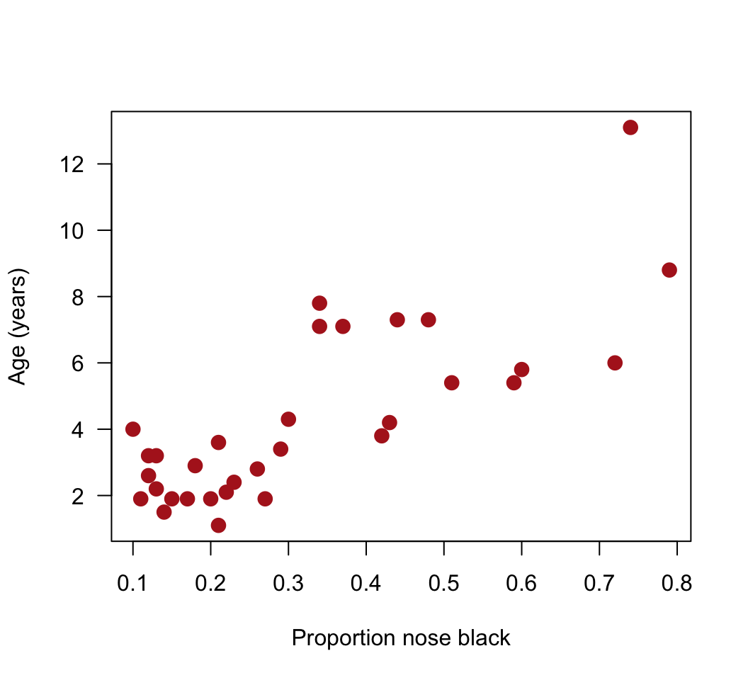
Fit a linear model
Fit a linear model to the lion data. Store the output in an
lm()object. Choose the response and explanatory variables with care: we want to predict age from the proportion black in the nose.Add the best-fit line to the scatter plot. Does the relationship appear linear? From the scatter plot, visually check for any serious problems such as outliers or changes in the variance of residuals.*
Using the same fitted model object, obtain the estimates for the coefficients and standard errors. What does the first coefficient refer to? What does the second coefficient refer to? What is the \(R^2\) value for the model fit?**
Obtain 95% confidence intervals for the slope and intercept.
Test the fit of the model to the data with an ANOVA table.
Apply the
plot()command to thelm()object created in (1) to diagnose violations of assumptions (keep hitting <return> in the command window to see all the plots). Recall the assumptions of linear models. Do the data conform to the assumptions? Are there any potential concerns? What options would be available to you to overcome any potential problems with meeting the assumptions?***
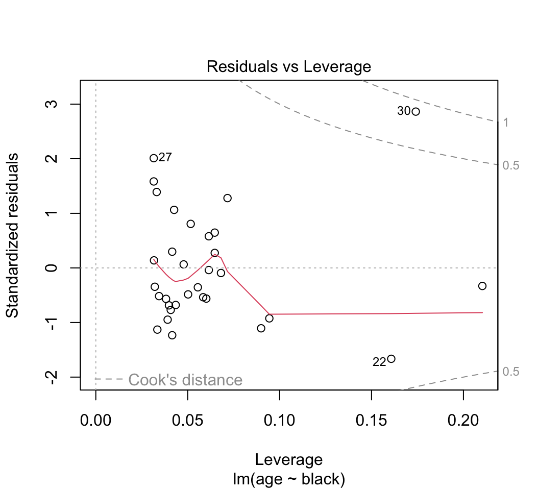
Most of the plots will be self-explanatory, except perhaps the last one. “Leverage” calculates the influence that each data point has on the estimated parameters. For example if the slope changes a great deal when a point is removed, that point is said to have high leverage. “Cook’s distance” measures the effect of each data point on the predicted values for all the other data points. A value greater than 1 is said to be worrisome. Points with high leverage don’t necessarily have high Cook’s distance, and vice versa.Optional: One of the data points (the oldest lion) has rather high leverage. To see the effect this has on the results, refit the data leaving this point out. Did this change the regression line substantially?
* The variance of the residuals for black in the nose tends to rise with increasing age but the trend is not severe. The residuals might not be quite normal, but they are not badly skewed so we are probably OK.
** Estimate of regression intercept. Estimate of slope. 0.61
*** It is even easier to see with these plots how the variance of the residuals tends to increase at higher fitted values. A transformation of one or both of the variables is usually the first course of action. R also has a toolkit for robust regression, which as the name suggests is more robust to violations of standard assumptions.
Answers
# 1. fit model
z <- lm(age ~ black, data=x)

# 2. Add the best-fit line to the scatter plot
plot(age ~ black, data = x, pch = 16, las = 1, col = "firebrick", cex = 1.5,
    xlab = "Proportion nose black", ylab = "Age (years)")
abline(z)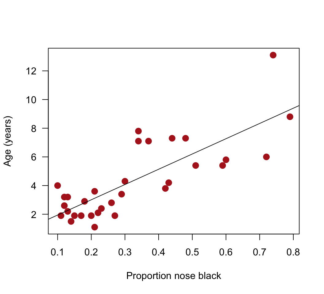
# Or use visreg
visreg(z, xlab = "Proportion nose black", ylab = "Age (years)")
Or use ggplot()
ggplot(x, aes(y = age, x = black)) +
  geom_point(size = 3, col = "firebrick") +
  geom_smooth(method = lm, col = "black", size = 0.5, se = FALSE) +
  labs(x = "Proportion nose black", y = "Age (years)") +
  theme_classic()
## Warning: Using `size` aesthetic for lines was deprecated in ggplot2 3.4.0.
## ℹ Please use `linewidth` instead.
## This warning is displayed once every 8 hours.
## Call `lifecycle::last_lifecycle_warnings()` to see where this warning was
## generated.## `geom_smooth()` using formula = 'y ~ x'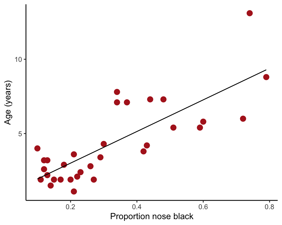
# 3. Estimate coefficients
# "(Intercept)" refers to intercept, "black" to slope
summary(z)
##
## Call:
## lm(formula = age ~ black, data = x)
##
## Residuals:
## Min 1Q Median 3Q Max
## -2.5449 -1.1117 -0.5285 0.9635 4.3421
##
## Coefficients:
## Estimate Std. Error t value Pr(>|t|)
## (Intercept) 0.8790 0.5688 1.545 0.133
## black 10.6471 1.5095 7.053 7.68e-08 ***
## ---
## Signif. codes: 0 '***' 0.001 '**' 0.01 '*' 0.05 '.' 0.1 ' ' 1
##
## Residual standard error: 1.669 on 30 degrees of freedom
## Multiple R-squared: 0.6238, Adjusted R-squared: 0.6113
## F-statistic: 49.75 on 1 and 30 DF, p-value: 7.677e-08# 4. 95% confidence intervals
visreg(z, points.par = list(pch = 16, cex = 1.2, col = "firebrick"))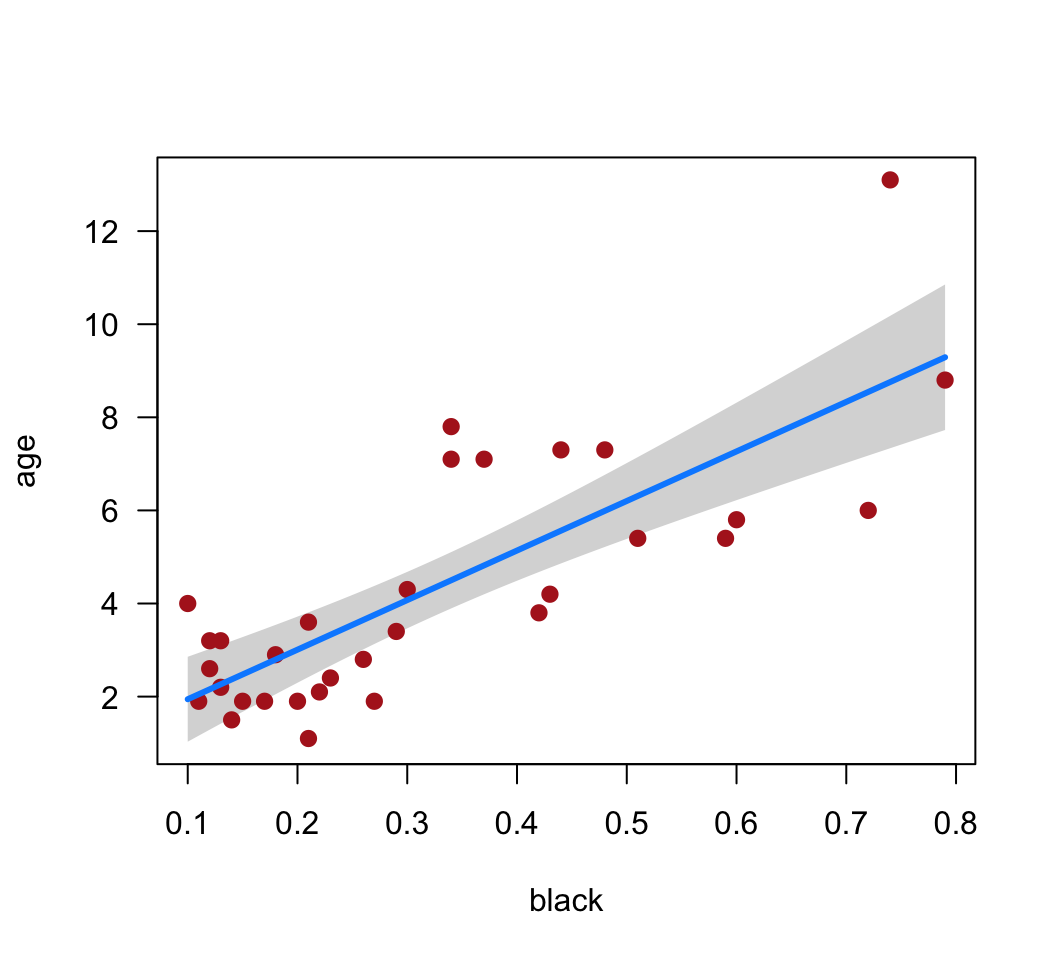
# 5. ANOVA table
anova(z)
## Analysis of Variance Table
##
## Response: age
## Df Sum Sq Mean Sq F value Pr(>F)
## black 1 138.544 138.544 49.75 7.677e-08 ***
## Residuals 30 83.543 2.785
## ---
## Signif. codes: 0 '***' 0.001 '**' 0.01 '*' 0.05 '.' 0.1 ' ' 1# 6. Diagnostics
plot(z)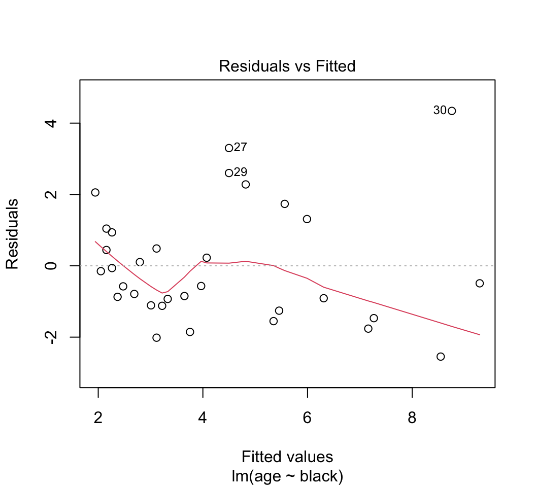


# 7. Redo after removing oldest lion
z1 <- lm(age ~ black, data=x[x$age < 12, ])
summary(z1)
##
## Call:
## lm(formula = age ~ black, data = x[x$age < 12, ])
##
## Residuals:
## Min 1Q Median 3Q Max
## -2.0522 -0.9810 -0.4072 0.6353 3.4973
##
## Coefficients:
## Estimate Std. Error t value Pr(>|t|)
## (Intercept) 1.2938 0.5089 2.542 0.0166 *
## black 8.8498 1.4175 6.243 8.19e-07 ***
## ---
## Signif. codes: 0 '***' 0.001 '**' 0.01 '*' 0.05 '.' 0.1 ' ' 1
##
## Residual standard error: 1.447 on 29 degrees of freedom
## Multiple R-squared: 0.5734, Adjusted R-squared: 0.5587
## F-statistic: 38.98 on 1 and 29 DF, p-value: 8.191e-07Prediction
Display the data once again in a scatter plot. Add the regression line.
Add 95% confidence bands to the scatter plot. These are confidence limits for the prediction of mean of lion age at each value of the explanatory variable. You can think of these as putting bounds on the most plausible values for the “true” or population regression line. Note the spread between the upper and lower limits and how this changes across the range of values for age.
Add 95% prediction intervals to the scatter plot. These are confidence limits for the prediction of new individual lion ages at each value of the explanatory variable. Whereas confidence bands address questions like “what is the mean age of lions whose proportion black in the nose is 0.5 ?”, prediction intervals address questions like “what is the age of that new lion over there, which has a proportion black in the nose of 0.5 ?”. Which of these predictions should have the greater uncertainty?
Examine the confidence bands and prediction intervals. Is the prediction of mean lion age from black in the nose relatively precise? Is prediction of individual lion age relatively precise? Could this relationship be used in the field to age lions?
Answers
z <- lm(age ~ black, data=x)
x2 <- predict(z, interval = "prediction")
## Warning in predict.lm(z, interval = "prediction"): predictions on current data refer to _future_ responsesx2 <- cbind.data.frame(x, x2)
ggplot(x2, aes(y = age, x = black)) +
geom_point(size = 3, col = "firebrick") +
geom_smooth(method = "lm", se = TRUE) +
geom_line(aes(y = lwr), color = "black", linetype = "dashed") +
geom_line(aes(y = upr), color = "black", linetype = "dashed") +
labs(x = "Proportion nose black", y = "Age (years)") +
theme_classic()## `geom_smooth()` using formula = 'y ~ x'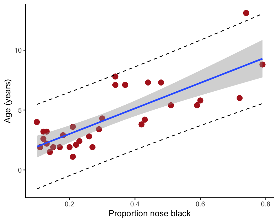
Light and circadian rhythms
Our second example fits a linear model with a categorical explanatory variable. The data are from an experiment by Wright and Czeisler (2002. Science 297: 571) that re-examined a previous claim that light behind the knees could reset the circadian rhythm of an individual the same way as light to the eyes. One of three light treatments was randomly assigned to 22 subjects (a three-hour episode of bright lights to the eyes, to the knees, or to neither). Effects were measured two days later as the magnitude of phase shift in each subject’s daily cycle of melatonin production, measured in hours. A negative measurement indicates a delay in melatonin production, which is the predicted effect of light treatment. The data can be downloaded here.
Read and examine the data
Read the data from the file.
View the first few lines of data to make sure it was read correctly.
Plot the phase shift data, showing the individual data points in each treatment group.
Determine whether the categorical variable “treatment” is a factor. If not a factor, convert treatment to a factor using the
factor()command. This will be convenient when we fit the linear model.Use the
levels()command on the factor variable “treatment” to see how R has ordered the different treatment groups. The order will be alphabetical, by default. Conveniently, you will find that the control group is listed first in the alphabetical sequence. (As you are about to analyze these data with a linear model in R, can you think of why having the control group first in the order is convenient?)To get practice, change the order of the levels so that the “knee” treatment group is second in the order, after “control”, and the “eyes” group is listed third.
Plot the phase shift data again to see the result.
Fit a linear model
Fit a linear model to the light treatment data. Store the output in an
lm()object.Create a graphic that illustrates the fit of the model to the data. In other words, include the predicted (fitted) values to your plot.
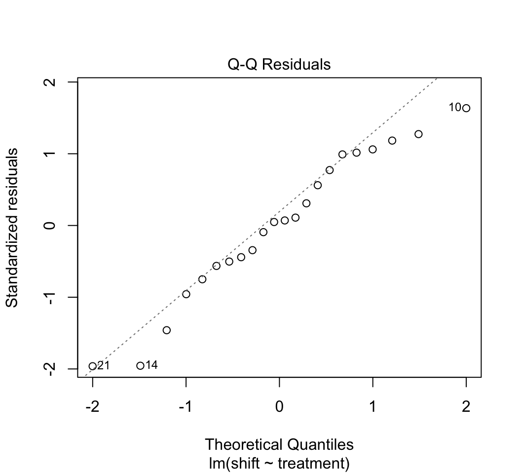
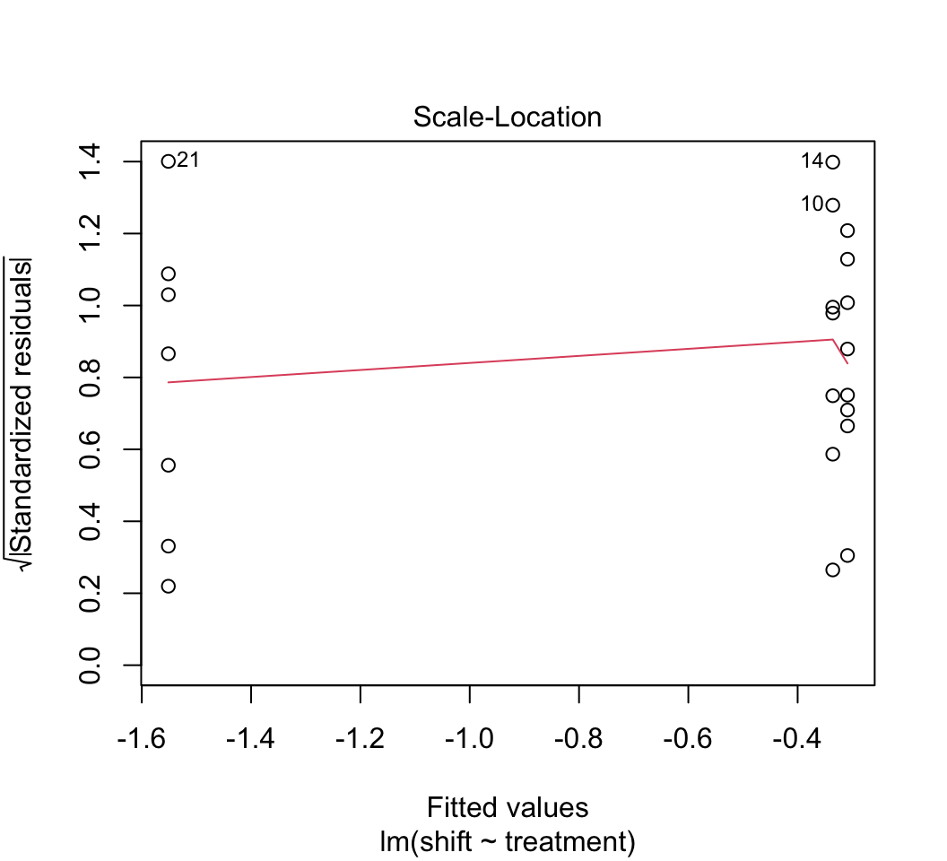
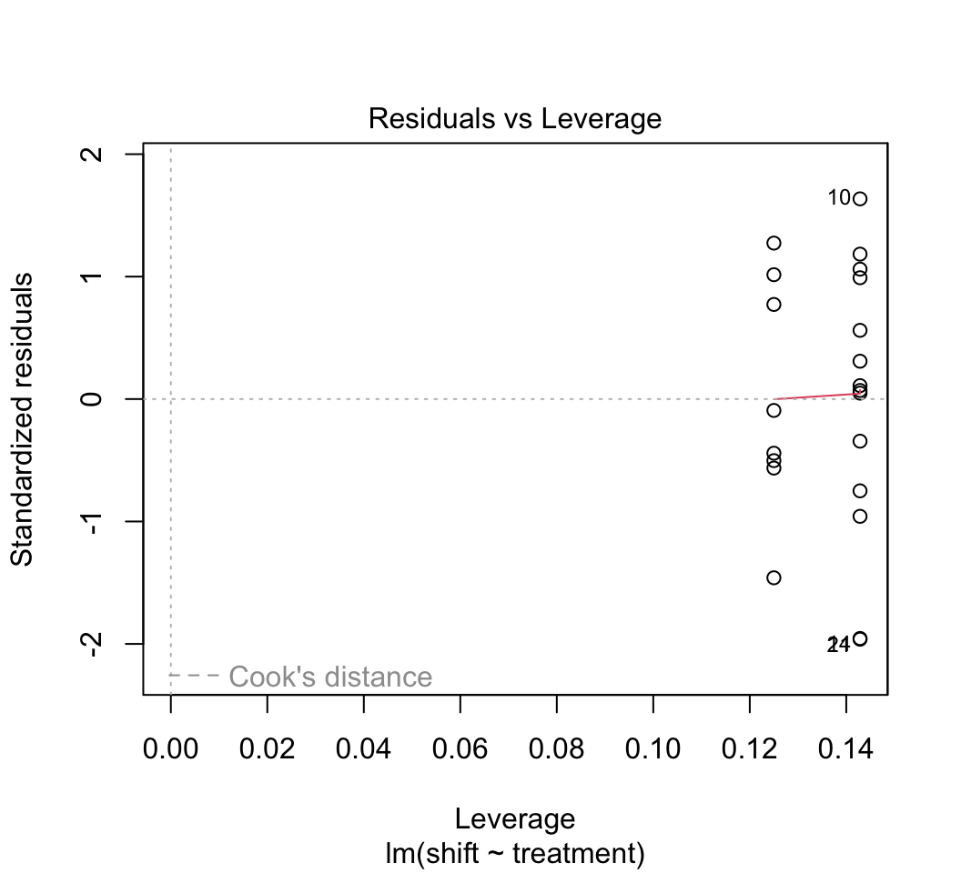
Use
plot()to check whether the assumptions of linear models are met in this case. Examine the plots. Are there any potential concerns? There are several options available to you if the assumptions are not met (transformations, robust regression methods, etc.) but we don’t seem to need them in this case.Remember from lecture that R represents the different levels of the categorical variable using dummy variables. To peek at this behind-the-scenes representation, use the
model.matrix()command on the model object from your linear model fit in step (1). The output should have a column of 1’s for the intercept and two additional columns representing two of the three levels of the explanatory variable. Why is one level left out? Which level is the one not represented by a dummy variable?*Using the
lm()model object, obtain the parameter estimates (coefficients) along with standard errors. Examine the parameter estimates. If you’ve done the analysis correctly, you should see the three coefficients. Rounded, they are -0.309, -0.027, and -1.24. What do each of these coefficients represent – what is being estimated by each value?** Note that the output will also include an \(R^2\) value. This is loosely interpretable as the “percent of the variance in phase shift that is explained by treatment.”The P-values associated with the three coefficients are generally invalid. Why? Under what circumstance might one of the P-values be valid?***
Obtain 95% confidence intervals for the three parameters.
Test the effect of light treatment on phase shift with an ANOVA table.
Produce a table of the treatment means using the fitted model object, along with standard errors and confidence intervals. Why are these values not the same as those you would get if you calculated means and SE’s separately on the data from each treatment group?
* One of the columns must be dropped because the information in the 4 columns is redundant in a particular way (a combination of three of the columns exactly equals the fourth). By default, R drops the column corresponding to the first level of the categorical variables.
** The mean of the first group; the difference between the means of the second and first groups; the difference between the means of the third and first groups.
*** The tests shown are t-tests of differences between means. However, a posteriori pairwise comparisons (unplanned comparisons) between groups requires a Tukey test or other test that accounts for the total number of pairwise comparisons of means. The only time a t-test is valid is when you carry out a planned comparison.
Answers
Read and examine the data.
library(visreg)
library(ggplot2)
library(emmeans)

# 1.
x <- read.csv(url("https://www.zoology.ubc.ca/~bio501/R/data/knees.csv"))

# 2.
head(x)
## treatment shift
## 1 control 0.20
## 2 control 0.53
## 3 control -0.68
## 4 control -0.37
## 5 control -0.64
## 6 control 0.36# 3.
is.factor(x$treatment)## [1] FALSEx$treatment <- factor(x$treatment)
# 4.
stripchart(shift ~ treatment, data=x, vertical = TRUE, method = "jitter",
jitter = 0.2, pch = 16, las = 1, cex = 1.5, col = "firebrick",
ylab = "Phase shift (h)")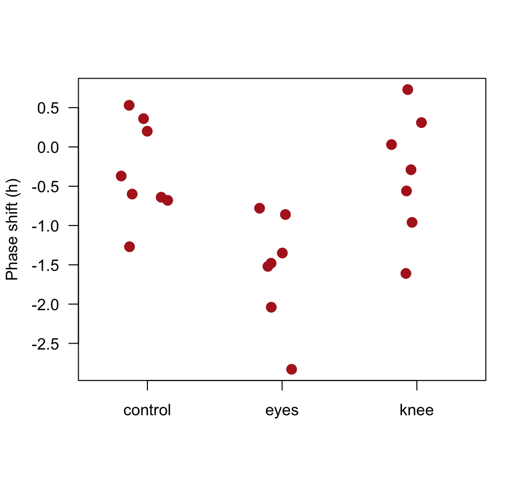
# 5.
levels(x$treatment)
## [1] "control" "eyes" "knee"# 6.
x$treatment <- factor(x$treatment, levels = c("control", "knee", "eyes"))
levels(x$treatment)## [1] "control" "knee" "eyes"# 7.
stripchart(shift ~ treatment, data=x, vertical = TRUE, method = "jitter",
jitter = 0.2, pch = 16, las = 1, cex = 1.5, col = "firebrick",
ylab = "Phase shift (h)")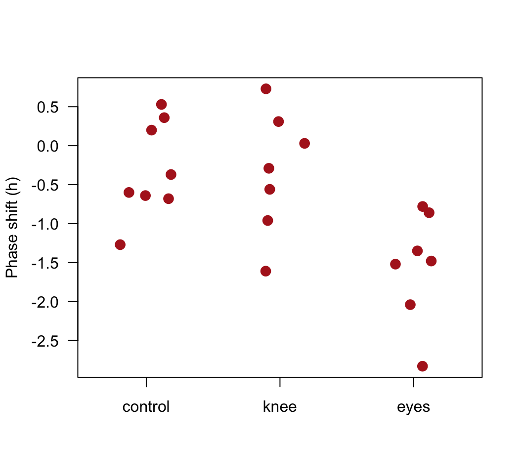
Fit a linear model
# 1.
z <- lm(shift ~ treatment, data=x)

# 2.
visreg(z, whitespace = 0.4, points.par = list(cex = 1.2, col = "firebrick"))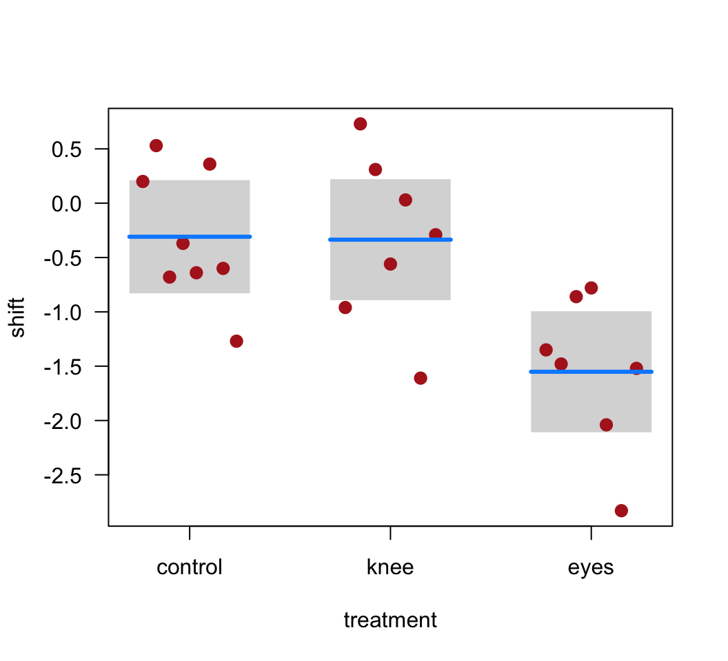
# 3.
plot(z)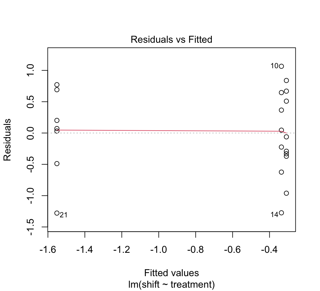
# 4.
model.matrix(z)
## (Intercept) treatmentknee treatmenteyes
## 1 1 0 0
## 2 1 0 0
## 3 1 0 0
## 4 1 0 0
## 5 1 0 0
## 6 1 0 0
## 7 1 0 0
## 8 1 0 0
## 9 1 1 0
## 10 1 1 0
## 11 1 1 0
## 12 1 1 0
## 13 1 1 0
## 14 1 1 0
## 15 1 1 0
## 16 1 0 1
## 17 1 0 1
## 18 1 0 1
## 19 1 0 1
## 20 1 0 1
## 21 1 0 1
## 22 1 0 1
## attr(,"assign")
## [1] 0 1 1
## attr(,"contrasts")
## attr(,"contrasts")$treatment
## [1] "contr.treatment"# 5.
summary(z)##
## Call:
## lm(formula = shift ~ treatment, data = x)
##
## Residuals:
## Min 1Q Median 3Q Max
## -1.27857 -0.36125 0.03857 0.61147 1.06571
##
## Coefficients:
## Estimate Std. Error t value Pr(>|t|)
## (Intercept) -0.30875 0.24888 -1.241 0.22988
## treatmentknee -0.02696 0.36433 -0.074 0.94178
## treatmenteyes -1.24268 0.36433 -3.411 0.00293 **
## ---
## Signif. codes: 0 '***' 0.001 '**' 0.01 '*' 0.05 '.' 0.1 ' ' 1
##
## Residual standard error: 0.7039 on 19 degrees of freedom
## Multiple R-squared: 0.4342, Adjusted R-squared: 0.3746
## F-statistic: 7.289 on 2 and 19 DF, p-value: 0.004472# 7.
confint(z)## 2.5 % 97.5 %
## (Intercept) -0.8296694 0.2121694
## treatmentknee -0.7895122 0.7355836
## treatmenteyes -2.0052265 -0.4801306# 8.
anova(z)## Analysis of Variance Table
##
## Response: shift
## Df Sum Sq Mean Sq F value Pr(>F)
## treatment 2 7.2245 3.6122 7.2894 0.004472 **
## Residuals 19 9.4153 0.4955
## ---
## Signif. codes: 0 '***' 0.001 '**' 0.01 '*' 0.05 '.' 0.1 ' ' 1# 9.
# The ANOVA method assumes that the variance of the residuals is the same
# in every group. The SE's and confidence intervals for means make use of
# the mean squared error from the model fit, not just the values in the group.
emmeans(z, "treatment")## treatment emmean SE df lower.CL upper.CL
## control -0.309 0.249 19 -0.830 0.212
## knee -0.336 0.266 19 -0.893 0.221
## eyes -1.551 0.266 19 -2.108 -0.995
##
## Confidence level used: 0.95Fly sex and longevity
We analyzed these data previously in our graphics workshop. Here we will continue our analysis by fitting a linear model to the data.
The data are from L. Partridge and M. Farquhar (1981) Sexual activity and the lifespan of male fruit flies, Nature 294: 580-581. The experiment placed male fruit flies with varying numbers of previously-mated or virgin females to investigate whether mating activity affects male lifespan. To begin, download the file fruitflies.csv from here.
The linear model will have longevity as the response variable, and two explanatory variables: treatment (categorical) and thorax length (numerical; representing body size). The goal will be to compare differences in fly longevity among treatment groups, correcting for differences in thorax length. Correcting for thorax length will possibly improve the estimates of treatment effect. The method is also known as analysis of covariance, or ANCOVA.
Read and examine data
Read the data from the file.
View the first few lines of data to make sure it was read correctly.
Determine whether the categorical variable “treatment” is a factor. If not a factor, convert treatment to a factor. This will be convenient when we fit the linear model.
Use the
levels()command on the factor variable “treatment” to see how R has ordered the different treatment groups (should be alphabetically).Change the order of the categories so that a sensible control group is first in the order of categories. Arrange the order of the remaining categories as you see fit.
Optional: This repeats an exercise from the graphics workshop. Create a scatter plot, with longevity as the response variable and body size (thorax length) as the explanatory variable. Use a single plot with different symbols (and colors too, if you like) for different treatment groups. Or make a multipanel plot using the
latticeorggplot2package
Answers
Read and examine the data.
# 1.
fly <- read.csv(url("https://www.zoology.ubc.ca/~bio501/R/data/fruitflies.csv"))
# 2.
head(fly)## Npartners treatment longevity.days thorax.mm
## 1 8 8 pregnant females 35 0.64
## 2 8 8 pregnant females 37 0.68
## 3 8 8 pregnant females 49 0.68
## 4 8 8 pregnant females 46 0.72
## 5 8 8 pregnant females 63 0.72
## 6 8 8 pregnant females 39 0.76# 3.
is.factor(fly$treatment)## [1] FALSEfly$treatment <- factor(fly$treatment)
# 4.
levels(fly$treatment)## [1] "1 pregnant female" "1 virgin female" "8 pregnant females"
## [4] "8 virgin females" "no females added"# 5.
# Put the controls first
fly$treatment <- factor(fly$treatment, levels=c("no females added",
"1 virgin female", "1 pregnant female", "8 virgin females",
"8 pregnant females"))
# 6.
# See earlier workshop for overlaid graph.
# Here's a multipanel plot
ggplot(fly, aes(thorax.mm, longevity.days)) +
geom_point(col = "firebrick", size = 2) +
geom_smooth(method = lm, size = I(1), se = FALSE, col = "black") +
xlab("Thorax (mm)") + ylab("Longevity (days)") +
facet_wrap(~treatment, ncol = 2) +
theme_classic()## `geom_smooth()` using formula = 'y ~ x'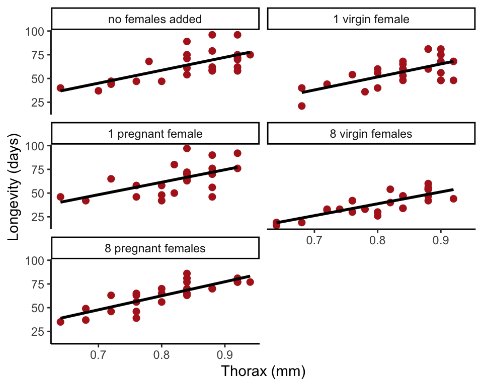 //: –>
Fit a linear model
Fit a linear model to the fly data, including both body size (thorax length) and experimental treatment as explanatory variables. Place thorax length before treatment in the model formula. Why is this a good idea? Leave out the interaction term for now – we’ll assume for now that there is no interaction between the explanatory variables thorax and treatment.
Use
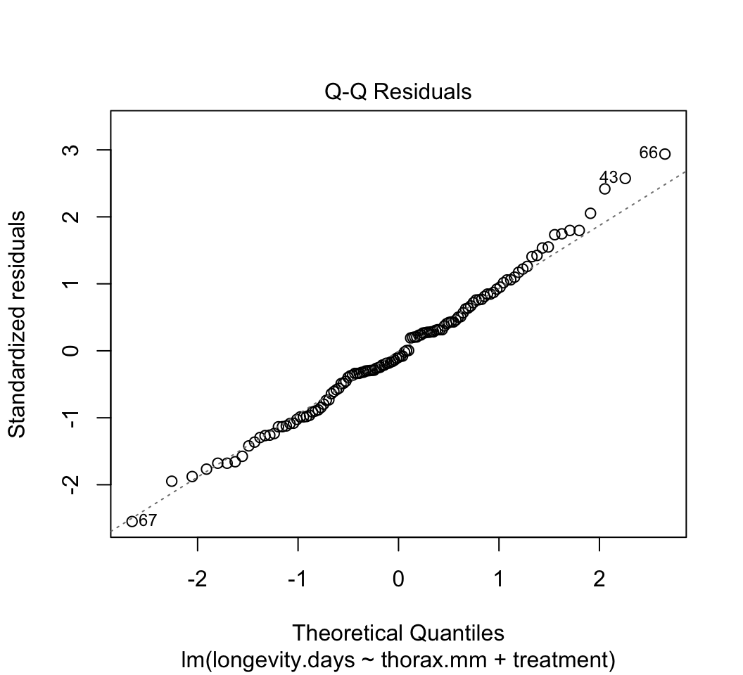
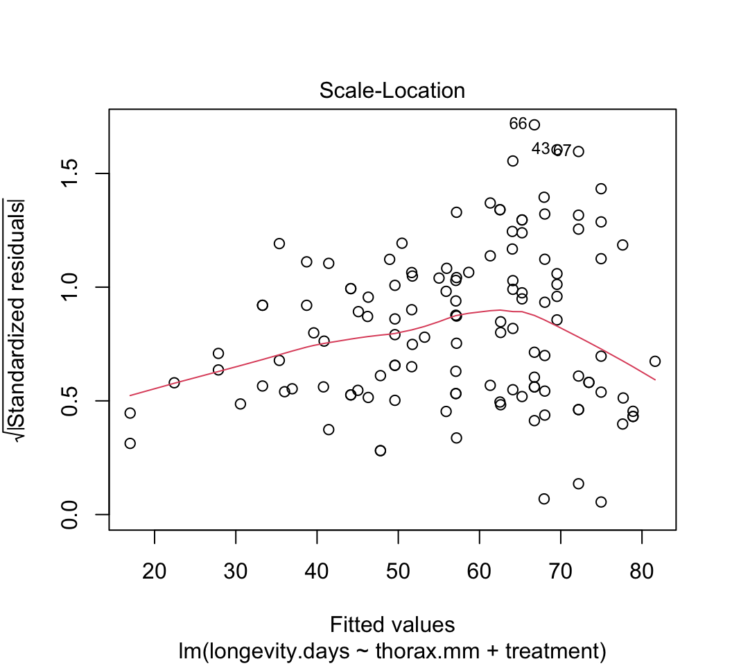
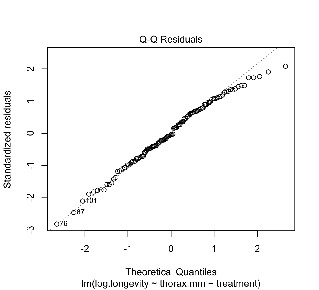
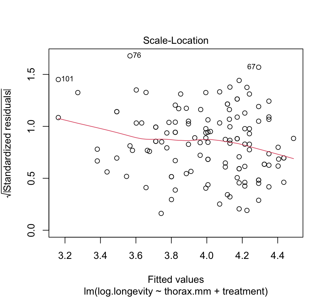
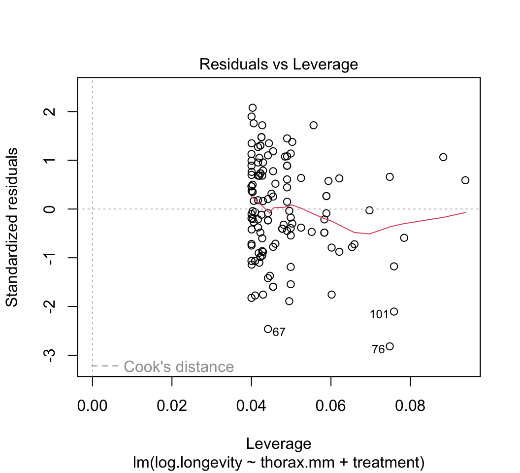
plot()to check whether the assumptions of linear models are met in this case. Are there any potential concerns? If you have done the analysis correctly, you will see that the variance of the residuals is not constant, but increases with increasing fitted values. This violates the linear model assumption of equal variance of residuals.Attempt to fix the problem identified in step (3) using a log-transformation of the response variable. Refit the model and reapply the graphical diagnostic tools to check assumptions. Any improvements? (To my eye the situation is improved but the issue has not gone away entirely.) Let’s continue anyway with the log-transformed analysis.
Visualize the fit of the model to the data using the
visregpackage. Plot the fit of the response variable to thorax length separately for each treatment group. Plot in separate panels or overlay the different treatments onto a single plot. Which is more successful at showing the fit of the model to the data?Obtain the parameter estimates and standard errors for the fitted model. Interpret the parameter estimates. What do they represent**? Which treatment group differs most from the control group?
Obtain 95% confidence intervals for the treatment and slope parameters.
Test overall treatment effects with an ANOVA table. Interpret each significance test – what exactly is being tested?
Refit the model to the data but this time reverse the order in which you entered the two explanatory variables in the model. I’m not saying this is a good idea, but bear with me. Test the treatment effects with an ANOVA table. Why isn’t the table identical to the one from your analysis in (7)***?
Our analysis so far has constrained the regression slopes for different treatment groups to be the same. We did this by leaving out an interaction term, which would allow the slopes to vary freely. Is this a reasonable assumption? We have the opportunity to investigate just how different the estimated slopes really are. To do this, fit a new linear model to the data, but this time include an interaction term between the explanatory variables. Plot the model fit. How different are the slopes to the eye?
The parameters will be more complicated to interpret in a model that includes an interaction term, so lets skip
summary()for now. Instead, go right to the ANOVA table to test the interaction term using the new model fit. Interpret the result. Does it mean that the interaction term really is zero?Another way to help assess whether the assumption of no interaction is a sensible one for these data is to determine whether the fit of the model is “better” when an interaction term is present or not, and by how much. We will learn new methods later in the course to determine this, but in the meantime a simple measure of model fit can be obtained using the adjusted R2 value. The ordinary R2 measures the fraction of the total variation in the response variable that is “explained” by the explanatory variables. This, however, cannot be compared between models that differ in the number of parameters because fitting more parameters always results in a larger R2, even if the added variables are just made-up random numbers. To compare the fit of models having different parameters, use the adjusted R2 value instead, which takes account of the number of parameters being fitted. Use the
summary()command on each of two fitted models, one with and the other without an interaction term, and compare their adjusted R2 values. Are they much different? If not, then maybe it is OK to assume that any interaction term is likely small and can be left out.
*The anova() command in R tests terms
sequentially. Putting the covariate first in the model formula ensures
it is included in the “reduced” and “full” models when testing treatment
effects.
**In a linear model with a factor and a continuous covariate, and no interaction term, the coefficient for the covariate is the common regression slope. The “intercept” coefficient represents the y-intercept of the first category (first level in the order of levels) of the treatment variable. Remaining coefficients represent the difference in intercept between that of each treatment category and the first category.
***R fits model terms sequentially when testing. Change the order of the terms in the formula for the linear model and the results might change.
Answers
# 1.
z <- lm(longevity.days ~ thorax.mm + treatment, data = fly)
# 2.
plot(z)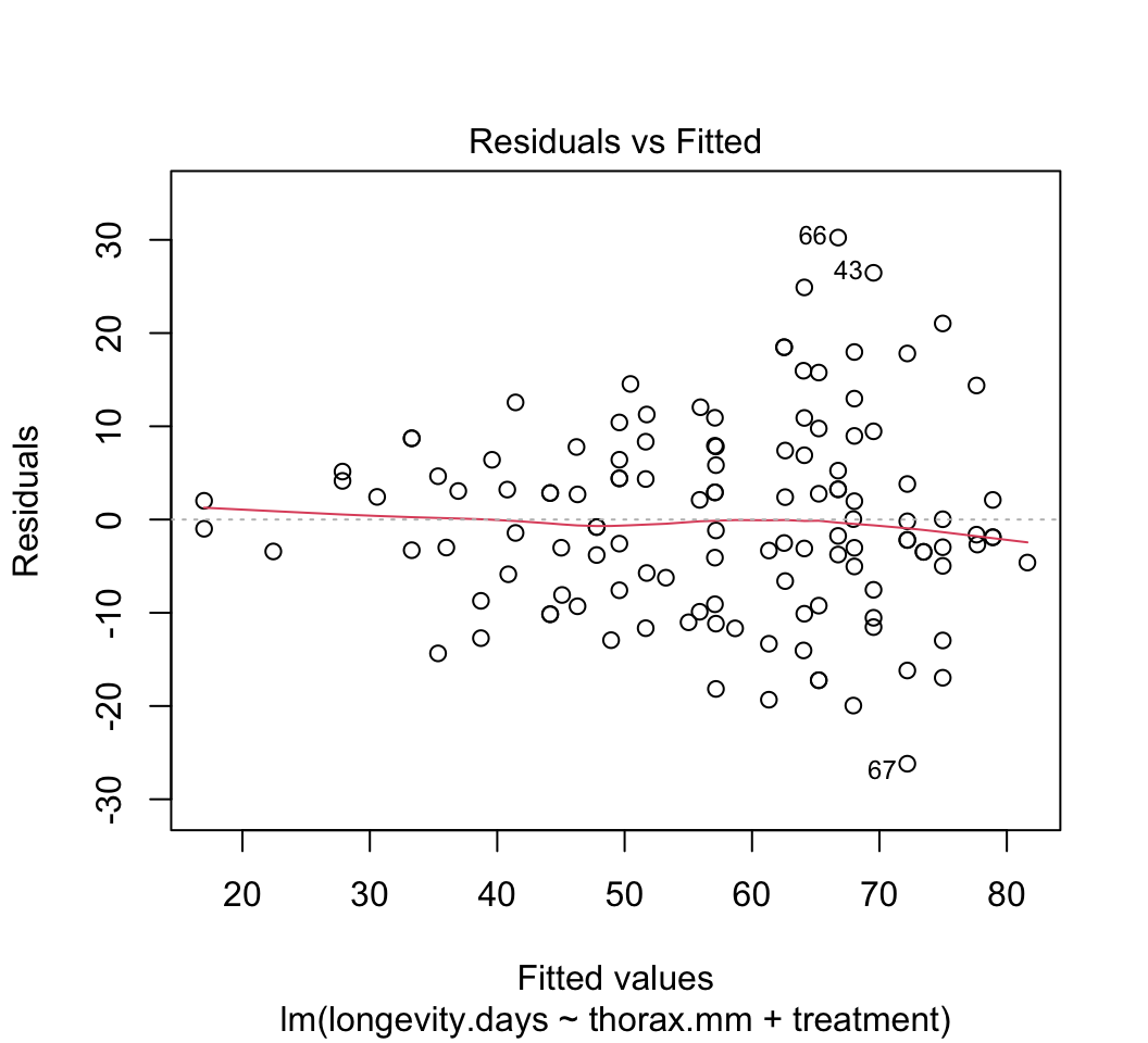

# 3.
fly$log.longevity<-log(fly$longevity)
z <- lm(log.longevity ~ thorax.mm + treatment, data = fly)
plot(z)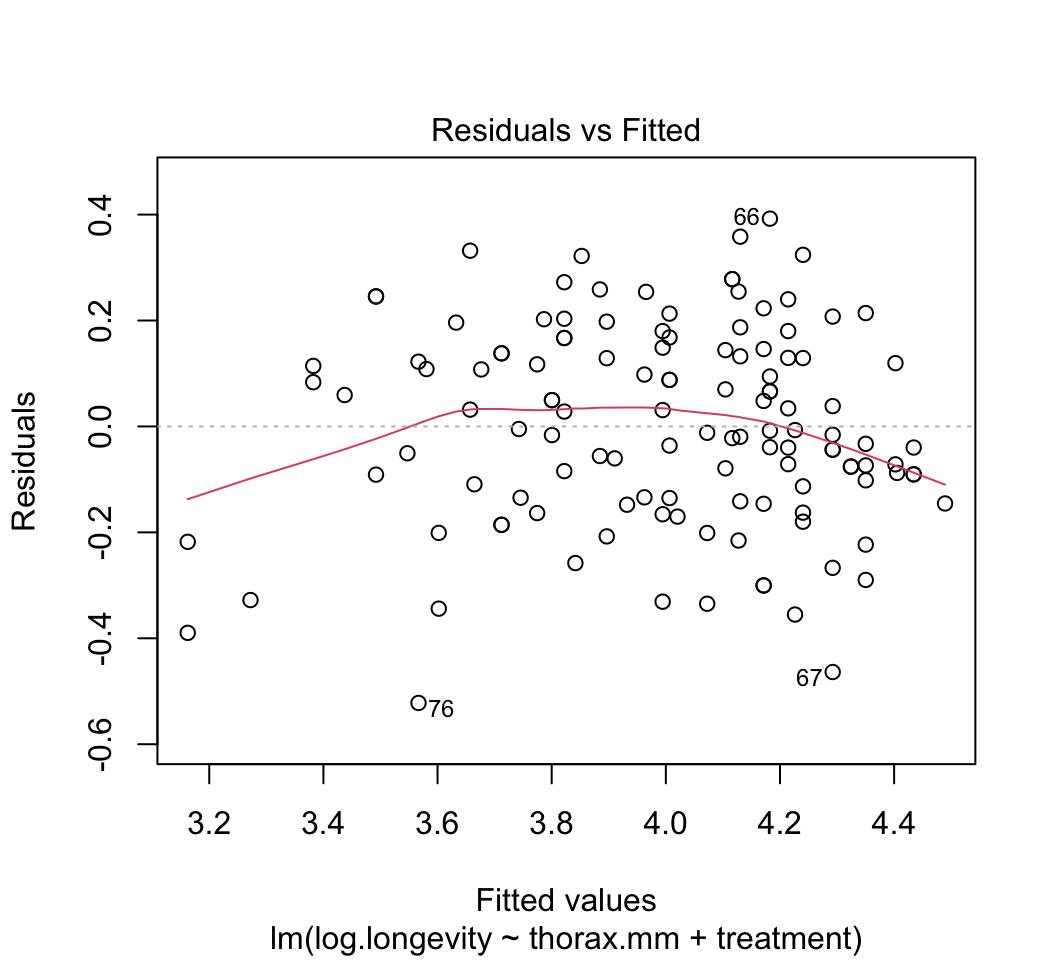
# 4.
# Separate plots in separate panels
visreg(z, xvar = "thorax.mm", by = "treatment", whitespace = 0.4,
points.par = list(cex = 1.1, col = "firebrick"))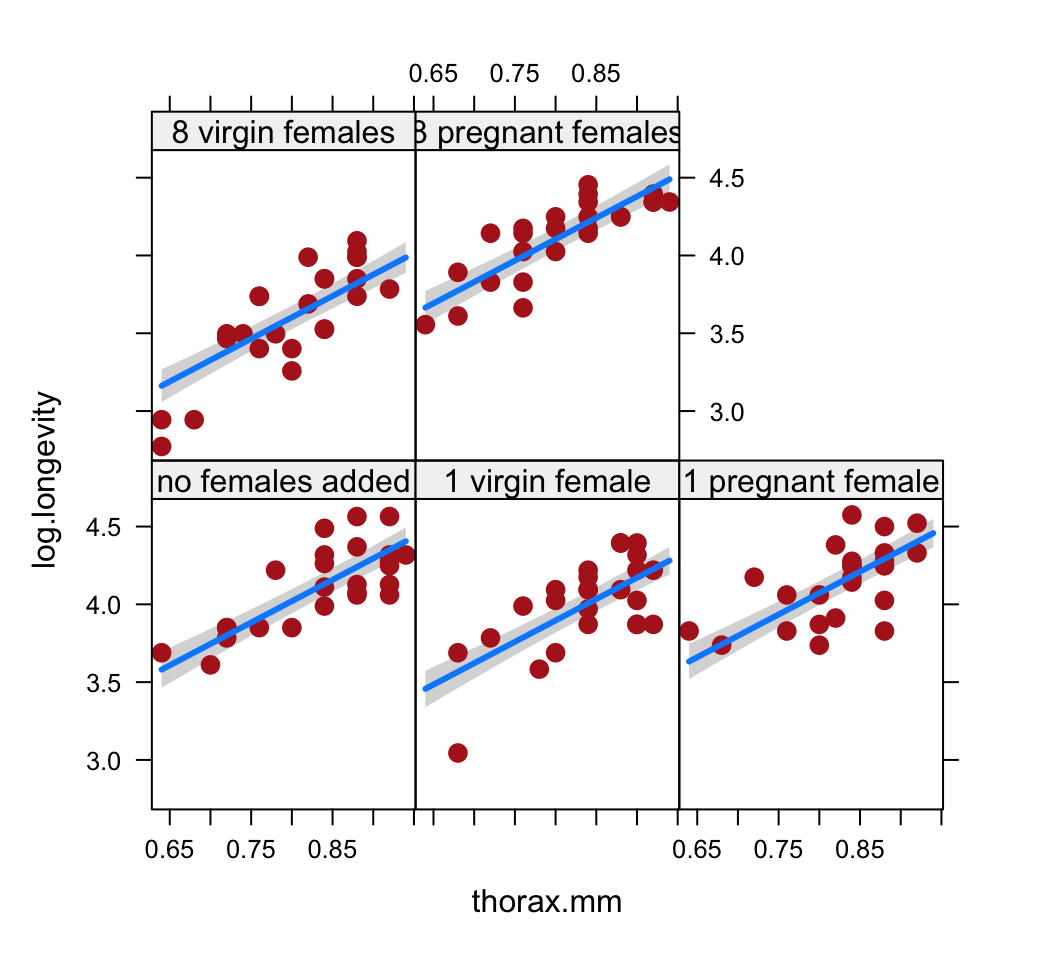
# Separate plots overlaid
visreg(z, xvar = "thorax.mm", by = "treatment", overlay = TRUE,
band = FALSE, points.par = list(cex = 1.1))
# 5.
summary(z)
##
## Call:
## lm(formula = log.longevity ~ thorax.mm + treatment, data = fly)
##
## Residuals:
## Min 1Q Median 3Q Max
## -0.52208 -0.13457 -0.00799 0.13807 0.39234
##
## Coefficients:
## Estimate Std. Error t value Pr(>|t|)
## (Intercept) 1.82123 0.19442 9.368 5.89e-16 ***
## thorax.mm 2.74895 0.22795 12.060 < 2e-16 ***
## treatment1 virgin female -0.12391 0.05448 -2.275 0.0247 *
## treatment1 pregnant female 0.05203 0.05453 0.954 0.3419
## treatment8 virgin females -0.41826 0.05509 -7.592 7.79e-12 ***
## treatment8 pregnant females 0.08401 0.05491 1.530 0.1287
## ---
## Signif. codes: 0 '***' 0.001 '**' 0.01 '*' 0.05 '.' 0.1 ' ' 1
##
## Residual standard error: 0.1926 on 119 degrees of freedom
## Multiple R-squared: 0.7055, Adjusted R-squared: 0.6932
## F-statistic: 57.02 on 5 and 119 DF, p-value: < 2.2e-16# 6.
confint(z)## 2.5 % 97.5 %
## (Intercept) 1.43626358 2.20619388
## thorax.mm 2.29759134 3.20030370
## treatment1 virgin female -0.23177841 -0.01604413
## treatment1 pregnant female -0.05593661 0.15999702
## treatment8 virgin females -0.52734420 -0.30918075
## treatment8 pregnant females -0.02472886 0.19273902# 7.
anova(z)## Analysis of Variance Table
##
## Response: log.longevity
## Df Sum Sq Mean Sq F value Pr(>F)
## thorax.mm 1 6.4256 6.4256 173.23 < 2.2e-16 ***
## treatment 4 4.1499 1.0375 27.97 2.231e-16 ***
## Residuals 119 4.4141 0.0371
## ---
## Signif. codes: 0 '***' 0.001 '**' 0.01 '*' 0.05 '.' 0.1 ' ' 1# 8.
z1 <- lm(log.longevity ~ treatment + thorax.mm, data = fly)
anova(z1)## Analysis of Variance Table
##
## Response: log.longevity
## Df Sum Sq Mean Sq F value Pr(>F)
## treatment 4 5.1809 1.2952 34.918 < 2.2e-16 ***
## thorax.mm 1 5.3946 5.3946 145.435 < 2.2e-16 ***
## Residuals 119 4.4141 0.0371
## ---
## Signif. codes: 0 '***' 0.001 '**' 0.01 '*' 0.05 '.' 0.1 ' ' 1# 9.
z <- lm(log.longevity ~ thorax.mm * treatment, data = fly)
visreg(z, xvar = "thorax.mm", by = "treatment", whitespace = 0.4,
points.par = list(cex = 1.1, col = "firebrick"))
# Separate plots overlaid
visreg(z, xvar = "thorax.mm", by = "treatment", overlay = TRUE,
    band = FALSE, points.par = list(cex = 1.1))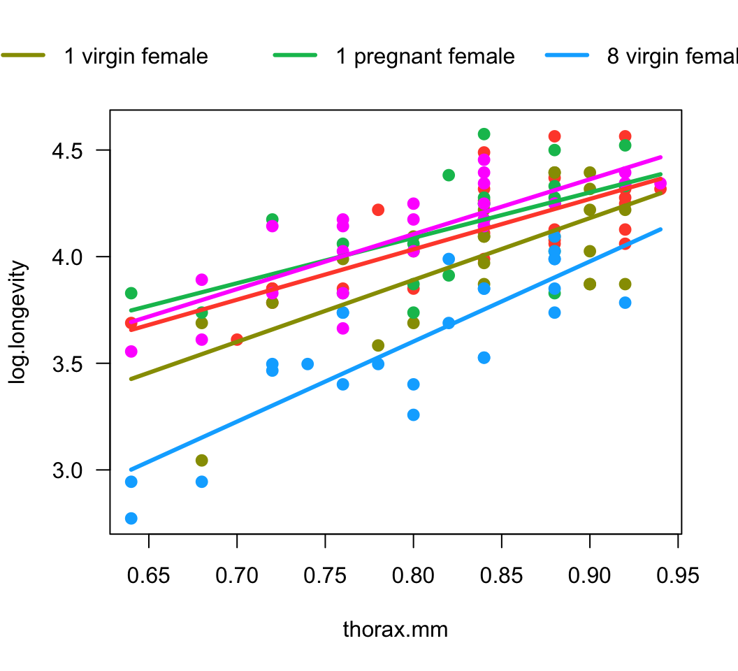
# 10.
anova(z)
## Analysis of Variance Table
##
## Response: log.longevity
## Df Sum Sq Mean Sq F value Pr(>F)
## thorax.mm 1 6.4256 6.4256 176.4955 <2e-16 ***
## treatment 4 4.1499 1.0375 28.4970 <2e-16 ***
## thorax.mm:treatment 4 0.2273 0.0568 1.5611 0.1894
## Residuals 115 4.1868 0.0364
## ---
## Signif. codes: 0 '***' 0.001 '**' 0.01 '*' 0.05 '.' 0.1 ' ' 1# 11.
summary(z1)$adj.r.squared## [1] 0.6931502summary(z)$adj.r.squared## [1] 0.6988301© 2009-2026 Dolph Schluter